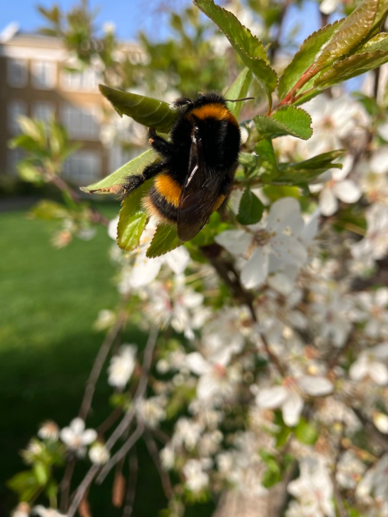
Bee on blossom by Jodiepedia, Public Domain Dedication (CC0) via Flickr.
If it weren’t for the bees we would be in trouble. In the worst case, life on Earth could go the way of Mars. No plants, no animals, no life. Bees are the main way that flowers get pollinated. As the bees sup the nectar they carry pollen from flower to flower, allowing new generations of flowers to grow. But the way a flower looks to our eyes isn’t the same way a bee sees it. For example, bee vision works into the ultraviolet part of the spectrum and under the correct lighting in a laboratory the wonderful, normally invisible, patterns that bees can see are revealed. Biologists all over the world have been collecting information about the sorts of patterns that particular flowers display. This display is called a spectral profile, and Samia Faruq, a computer science undergraduate at Queen Mary University of London has done her bit to help these scientists peer into the world of the bees.
Her project involved creating a massive online database containing worldwide spectral profile information, so scientists can search this information easily. They can also combine information to help discover new facts using a method called clustering, where the computer pulls together all the data with similar properties.
Samia enjoyed the project: “I met and worked with amazing biologists during the project. It was great to find out what they needed and to be able to create it for them. I got the chance to collaborate and publish material together with them too. To know it will be used in their research is also very rewarding.”
On Thursday 4th July 2024, millions of adults around the UK went to their local polling station to vote for their representative in the House of Commons. However, for the 18% of adults who have a disability, this can be considerably more challenging. While the right of voters to vote independently and secretly is so important, many blind and partially sighted people cannot do so without assistance. Thankfully this is changing, and this election was hailed as the most accessible yet. So how does technology enable blind and partially sighted people to vote independently?
There are two main challenges when it comes to voting for blind and partially sighted people. The names of candidates are listed down the left-hand side, so firstly, a voter needs to find the row of the person who they want to vote for. They then, secondly, need to put a cross in the box to the right. The image below gives an example of what the ballot paper looks like:
To solve the first problem, we can turn to audio. An audio device can be used to play a recording of the candidates as the appear on the ballot paper. Some charities also provide a phone number to call before the election, with a person who can read this list out. This is great, of course, but it does rely on the voter remembering the position of the person that they want to vote for. A blind or partially sighted voted is also allowed to use a text reader device, or perhaps a smart phone with a special app, to read out what is on the ballot paper in the booth.
Lots of blind and partially impaired people are able to read braille: a way of representing English words using bumps on the paper (read more about braille in this CS4FN article). One might think that this would solve all the problems, but, in fact, there is a requirement that all the ballot papers for each constituency have a standard design to ensure they can be counted efficiently and without error.
The solution to the second problem is far more practical: the excitingly named tactile voting device. This is a simple plastic device which is placed on top of the ballot paper. Each of the boxes on the ballot paper (as shown to the right of the image above), has a flap above it with its position number embossed on it. When the voter finds the number of the person they want to vote for, they simply turn over the flap, and are guided by a perfectly aligned square guide to where the box is. The voter can then use that guide to draw the cross in the box.
This whole process is considerably more complicated than it is for those without disabilities – and you might be thinking, “there must be an easier way!” Introducing the McGonagle Reader (MGR)! This device combines both solutions into one device that can be used in the voting booth. Like the tactile voting device, it has flaps which cover each of the boxes for drawing the cross. But, next to those, buttons, which, when pressed, read out the information of the candidate for that row. This can save lots of time, removing the need to remember the position of each candidate – a voter can simply go down the page and find who they want to vote for and turn over the correct flap.
When people have the right to vote, it is especially important to ensure that they have the ability to use that right. This means that no matter the cost or the logistics, everyone should have access to the tools they need to vote for their representative. Progress is now being made but a lot more work still needs to be done.
To help ensure this happens in future, the RNIB want to know the experiences of those who voted or didn’t vote in the UK 2024 general election – see the survey linked from the RNIB page here.
Communicating with computers is clunky to say the least – we even have to go to IT classes to learn how to talk to them. It would be so much easier if they went to school to learn how to talk to us. If computers are to communicate more naturally with us we need to understand more about how humans interact with each other.
The most obvious ways that we communicate is through speech – we talk, we listen – but actually our communication is far more subtle than that. People pick up lots of information about our emotions and what we really mean from the expressions and the tone of our voice – not from what we actually say. Zabir, a student at Queen Mary was interested in this so decided to experiment with these ideas for his final year project. He used a kit called Lego Mindstorm that makes it really easy to build simple robots. The clever stuff comes in because, once built, Mindstorm creations can be programmed with behaviour. The result was Blade.
In the video above you can see Blade the robot respond. Video by Zabir for QMUL
Blade, named after the Wesley Snipes film, was a robotic face capable of expressing emotion and responding to the tone of the user’s voice. Shout at Blade and he would look sad. Talk softly and, even though he could not understand a word of what you said he would start to appear happy again. Why? Because your tone says what you really mean whatever the words – that’s why parents talk gobbledegook softly to babies to calm them.
Blade was programmed using a neural network, a computer science model of the way the brain works, so he had a brain similar to ours in some simple ways. Blade learnt how to express emotions very much like children learn – by tuning the connections (his neurons) based on his experience. Zabir spent a lot of time shouting and talking softly to Blade, teaching him what the tone of his voice meant and so how to react. Blade’s behaviour wasn’t directly programmed, it was the ability to learn that was programmed.
Eventually we had to take Blade apart which was surprisingly sad. He really did seem to be more than a bunch of lego bricks. Something about his very human like expressions pulled on our emotions: the same trick that cartoonists pull with the big eyes of characters they want us to love.
Zabir went on to work in the city for Merchant Bank, JP Morgan
– Paul Curzon, Queen Mary University of London
⬇️ This article has also been published in two CS4FN magazines – first published on p13 in Issue 4, Computer Science and BioLife, and then again on page 18 in Issue 26 (Peter McOwan: Serious Fun), our magazine celebrating the life and research of Peter McOwan (who co-founded CS4FN with Paul Curzon and researched facial recognition). There’s also a copy on the original CS4FN website. You can download free PDF copies of both magazines below, and any of our other magazines and booklets from our CS4FN Downloads site.
This video below Why faces are special from Queen Mary University of London asks the question “How does our brain recognise faces? Could robots do the same thing?”.
Peter McOwan’s research into face recognition informed the production of this short film. Designed to be accessible to a wide audience, the film was selected as one of the finalist 55 from 1450 films submitted to the festival CERN CineGlobe film festival 2012.
Related activities
We have some fun paper-based activities you can do at home or in the classroom.
From our Teaching London Computing website. Find out about programs and sequences and how how high-level language is translated into low-level machine instructions.
Our most popular download sheet is the emotion machine https://t.co/HV14hDVAyq …as we are currently obsessed with #pringles Ho has now hacked it into a 3D version – program different emotions on your robot can by setting different sets of facial feature letters … pic.twitter.com/M1K0N1MP0z
Fom our Teaching London Computing website. Get people in your class (or at home if you have a big family) to make a giant robotic face that responds to commands.
For some reason biting flies home in on some people while leaving others (even those walking next to them) alone. What is going on, what does it have to do with the colour blue, and how is computer science helping?
There are lots of reasons biting flies are attracted to some people more than others. Smell is one reason, even possibly made worse if you use smelly soap as it can make you smell like an attractive flower! Another is the colour blue! It turns out many biting flies are attracted to people who wear blue! It sounds bizarre but it is the reason fly traps are coloured blue – to make them more effective. But why would a fly like blue? Scientists have been investigating. One theory was that it was because blue objects look like shade to a fly: once there the eating of you is a separate fortunate advantage (to the fly).
One area of Computer Science is known is biologically-inspired computing. The idea is that evolution, over Millenia of trial and error, has come up with lots of great ways to solve problems, and human designers can learn from them. By making computer systems copy the way animals solve those problems we can create better designs. One of the most successful versions of this is the neural network: a way of creating intelligent machines by copying the way animals’ brains are built from neurones. It has ultimately led to the chatbots that can write almost as well as humans and the game playing machines that can beat us at even the most complex games.
Another use of biologically-inspired computing is as a way of doing Science. By modelling the natural world with computer simulations we can better understand how it works. This computational modelling approach is revolutionising the way lots of Science is done. Aberystwyth University’s Roger Santer applied this idea to biting flies. His team created a computer model of the vision system of different kinds of biting flies to explore how they see the world, testing different theories about what was going on. The models were built from neural networks, trained to see like a fly rather than to be able to write or play games.
What the Aberystwyth team found was that to these kinds of flies, because of the way their vision systems work, areas of blue look just like a tasty meal, like animals that they like to bite. The neural networks could tell leaves from animals, but they often decided, incorrectly, that blue objects were animals. They could also correctly tell the difference between shade and non-shade but never mistook blue objects as shade. If their model is an accurate version of the actual way these flies see, then it suggests that the flies are not attracted to blue because it looks like shade, but because it looks like an animal!
The lesson therefore is, if you don’t want to look like a meat feast then do not wear blue when there are biting flies about!
Flies are small, fast and rather cunning. Try to swat one and you will see just how efficient their brain is, even though it has so few brain cells that each one of them can be counted and given a number. A fly’s brain is a wonderful proof that, if you know what you’re doing, you can efficiently perform clever calculations with a minimum of hardware. The average household fly’s ability to detect movement in the surrounding environment, whether it’s a fly swat or your hand, is due to some cunning wiring in their brain.
Movement is measured by detecting something changing position over time. The ratio distance/time gives us the speed, and flies have built in speed detectors. In the fly’s eye, a wonderful piece of optical engineering in itself with hundreds of lenses forming the mosaic of the compound eye, each lens looks at a different part of the surrounding world, and so each registers if something is at a particular position in space.
All the lenses are also linked by a series of nerve cells. These nerve cells each have a different delay. That means a signal takes longer to pass along one nerve than another. When a lens spots an object in its part of the world, say position A, this causes a signal to fire into the nerve cells, and these signals spread out with different delays to the other lenses’ positions.
The separation between the different areas that the lenses view (distance) and the delays in the connecting nerve cells (time) are such that a whole range of possible speeds are coded in the nerve cells. The fly’s brain just has to match the speed of the passing object with one of the speeds that are encoded in the nerve cells. When the object moves from A to B, the fly knows the correct speed if the first delayed signal from position A arrives at the same time as the new signal at position B. The arrival of the two signals is correlated. That means they are linked by a well-defined relation, in this case the speed they are representing.
Do locusts like Star Wars?
Understanding the way that insects see gives us clever new ways to build things, and can also lead to some bizarre experiments. Researchers in Newcastle showed locusts edited highlights from the original movie Star Wars. Why you might ask? Do locusts enjoy a good Science Fiction movie? It turns out that the researchers were looking to see if locusts could detect collisions. There are plenty of those in the battles between X-wing fighters and Tie fighters. They also wanted to know if this collision detecting ability could be turned into a design for a computer chip. The work, part-funded by car-maker Volvo, used such a strange way to examine locust’s vision that it won an Ig Nobel award in 2005. Ig Noble awards are presented each year for weird and wonderful scientific experiments, and have the motto ‘Research that makes people laugh then think’. You can find out more at http://improbable.com
Car crash: who is to blame?
So what happens if we start to use these insect ‘eye’ detectors in cars, building
We now have smart cars with the artificial intelligence (AI) taking over from the driver completely or just to avoid hitting other things. An interesting question arises. When an accident does happen, who is to blame? Is it the car driver: are they in charge of the vehicle? Is it the AI to blame? Who is responsible for that: the AI itself (if one day we give machines human-like rights), the car manufacturer? Is it the computer scientists who wrote the program? If we do build cars with fly or locust like intelligence, which avoid accidents like flies avoid swatting or can spot possible collisions like locusts, is it the insect whose brain was copied that is to blame!?!What will insurance companies decide? What about the courts?
As computer science makes new things possible, society quickly needs to decide how to deal with them. Unlike the smart cars, these decisions aren’t something we can avoid.
Peter W McOwan, Queen Mary University of London(updated from the archive)
Look out the window at the human-made world. It’s full of hard, geometric shapes – our buildings, the roads, our cars. They are made of solid things like tarmac, brick and metal that are designed to be rigid and stay that way. The natural world is nothing like that though. Things bend, stretch and squish in response to the forces around them. That provides a whole bunch of fascinating problems for computer scientists like Lourdes Agapito of Queen Mary, University of London to solve.
Computer scientists interested in creating 3-dimensional models of the world have so far mainly concentrated on modelling the hard things. Why? Because they are easier! You can see the results in computer-animated films like Toy Story, and the 3D worlds like Second Life your avatar inhabits. Even the soft things tend to be rigid.
Lourdes works in this general area creating 3D computer models, but she wants to solve the problems of creating them automatically just from the flat images in videos and is specifically interested in things that deform – the squishy things.
Look out the window and watch the world go by. As you watch a woman walk past you have no problem knowing that you are looking at the same person as you were a second ago – even if she becomes partially hidden as she walks behind the post box and turns to post a letter. The sun goes behind a cloud and the scene is suddenly darker. It starts to rain and she opens an umbrella. You can still recognise her as the same object. Your brain is pulling some amazing tricks to make this seem so mundane. Essentially it is creating a model of the world – identifying all the 3-dimensional objects that you see and tracking them over time. If we can do it, why can’t a computer?
Unlike hard surfaces, deformable ones don’t look the same from one still to the next. You don’t have to just worry about changes in lighting, them being partially hidden, and that they appear different from a different angle. The object itself will be a different shape from one still to the next. That makes it far harder to work out which bits of one image are actually the same as the ones in the next. Lourdes has taken on a seriously hard problem.
Existing vision systems that create 3D objects have made things easier for themselves by using existing models. If a computer already has a model of a cube to compare what it sees with, then spotting a cube in the image stream is much easier than working it out from scratch. That doesn’t really generalise to deformable objects though because they vary too much. Another approach, used by the film industry, is to put highly visible markers on objects so that those markers can be tracked. That doesn’t help if you just want to point a camera out the window at whatever passes by though.
Lourdes aim is to be able to point a camera at a deformable object and have a computer vision system be able to create a 3D model simply by analysing the images. No markers, no existing models of what might be there, not even previous films to train it with, just the video itself. So far her team have created a system that can do this in some situations such as with faces as a person changes their expression. Their next goal is to be able to make their system work for a whole person as they are filmed doing arbitrary things. It’s the technical challenge that inspires Lourdes the most, though once the problems of deformable objects are solved there are applications of course. One immediately obvious area is in operating theatres. Keyhole surgery is now very common. It involves a surgeon operating remotely, seeing what they are doing by looking at flat video images from a fibre optic probe inside the body of the person being operated on. The image is flat but the inside of the person that the surgeon is trying to make cuts in is 3-dimensional. It would be far less error prone if what the surgeon was looking at was an accurate 3D model of the video feed rather than just a flat picture. Of course the inside of your body is made of exactly the kind of squishy deformable surfaces that Lourdes is interested in. Get the computer science right and technologies like this will save lives.
At the same time as tackling seriously hard if squishy computer science problems, Lourdes is also a mother of three. A major reason she can fit it all in, as she points out, is that she has a very supportive partner who shares in the childcare. Without him it would be impossible to balance all the work involved in leading a top European research team. It’s also important to get away from work sometimes. Running regularly helps Lourdes cope with the pressures and as we write she is about to run her first half marathon.
Lourdes may or may not be the person who turns her team’s solutions into the applications that in the future save lives in operating theatres, spot suspicious behaviour in CCTV footage or allow film-makers to quickly animate the actions of actors. Whoever does create the applications, we still need people like Lourdes who are just excited about solving the fundamental problems in the first place.
Happy, though surprised, sockets Photo taken by Jo Brodie in 2016 at Gladesmore School in London.
Some people have a neurological condition called face blindness (also known as ‘prosopagnosia’) which means that they are unable to recognise people, even those they know well – this can include their own face in the mirror! They only know who someone is once they start to speak but until then they can’t be sure who it is. They can certainly detect faces though, but they might struggle to classify them in terms of gender or ethnicity. In general though, most people actually have an exceptionally good ability to detect and recognise faces, so good in fact that we even detect faces when they’re not actually there – this is called pareidolia – perhaps you see a surprised face in this picture of USB sockets below.
How about computers? There is a lot of hype about face recognition technology as a simple solution to help police forces prevent crime, spot terrorists and catch criminals. What could be bad about being able to pick out wanted people automatically from CCTV images, so quickly catch them?
What if facial recognition technology isn’t as good at recognising faces as it has sometimes been claimed to be, though? If the technology is being used in the criminal justice system, and gets the identification wrong, this can cause serious problems for people (see Robert Williams’ story in “Facing up to the problems of recognising faces“).
“An audit of commercial facial-analysis tools found that dark-skinned faces are misclassified at a much higher rate than are faces from any other group. Four years on, the study is shaping research, regulation and commercial practices.”
In 2018 Joy Buolamwini and Timnit Gebru shared the results of research they’d done, testing three different commercial facial recognition systems. They found that these systems were much more likely to wrongly classify darker-skinned female faces compared to lighter- or darker-skinned male faces. In other words, the systems were not reliable. (Read more about their research in “The gender shades audit“).
“The findings raise questions about how today’s neural networks, which … (look for) patterns in huge data sets, are trained and evaluated.”
Their work has shown that face recognition systems do have biases and so are not currently at all fit for purpose. There is some good news though. The three companies whose products they studied made changes to improve their facial recognition systems and several US cities have already banned the use of this tech in criminal investigations. More cities are calling for it too and in Europe, the EU are moving closer to banning the use of live face recognition technology in public places. Others, however, are still rolling it out. It is important not just to believe the hype about new technology and make sure we do understand their limitations and risks.
Jo Brodie and Paul Curzon, Queen Mary University of London
In 2009 Desi Cryer, who is Black, shared a light-hearted video with a serious message. He’d bought a new computer with a face tracking camera… which didn’t track his face, at all. It did track his White colleague Wanda’s face though. In the video (below) he asked her to go in front of the camera and move from side to side and the camera obediently tracked her face – wherever she moved the camera followed. When Desi moved back in front of the camera it stopped again. He wondered if the computer might be racist…
Another video, this time from 2017, showed a dark-skinned man failing to get a soap to dispenser to give him some soap. Nothing happened when he put his hand underneath the sensor but as soon as his lighter-skinned friend put his hand under it – out popped some soap! The only way the first man could get any soap dispensed was to put a white tissue on his hand first. He wondered if the soap dispenser might be racist…
What’s going on?
Probably no-one set out to maliciously design a racist device but designers might need to check that their products work with a range of different people before putting them on the market. This can save the company embarrassment as well as creating something that more people want to buy.
Sensors working overtime
Both devices use a sensor that is activated (or in these cases isn’t) by a signal. Soap dispensers shine a beam of light which bounces off a hand placed below it and some of that light is reflected back. Paler skin reflects more light (and so triggers the sensor) than darker skin. Next to the light is a sensor which responds to the reflected light – but if the device was only tested on White people then the sensor wasn’t adjusted for the full range of skin tones and so won’t respond appropriately. Similarly cameras have historically been designed for White skin tones meaning darker tones are not picked up as well.
Things can be improved!
It’s a good idea, when designing something that will be used by lots of different people, to make sure that it will work correctly with everyone. Having a diverse design team and, importantly, making sure that everyone feels empowered to contribute is a good way to start. Another is to test the design with different target audiences early in the design process so that changes can be made before it’s too late. How a company responds to feedback when they’ve made an oversight is also important. In the case of the computer company they acknowledged the problem and went to work to improve the camera’s sensitivity.
During the coronavirus pandemic many people bought a ‘pulse oximeter’, a device which clips painlessly onto a finger and measures how much oxygen is circulating in your blood (and your pulse). If the oxygen reading became too low people were advised to go to hospital. Oximeters shine red and infrared light from the top clip through the finger and the light is absorbed diferently depending on how much oxygen is present in the blood. A sensor on the lower clip measures how much light has got through but the reading can be affected by skin colour (and coloured nail polish). People were concerned that pulse oximeters would overestimate the oxygen reading for someone with darker skin (that is, tell them they had more oxygen than they actually had) and that the devices might not detect a drop in oxygen quickly enough to warn them.
In response the UK Government announced in August 2022 that it would investigate this bias in a range of medical devices to ensure that future devices work effectively for everyone.
The cave where most of the Dead Sea Scrolls were found. Image by Effi Schweizer, Public Domain from wikimedia
Computer science and artificial intelligence have provided a new way to do science: it was in fact one of the earliest uses of the computer. They are now giving new ways for scholars to do research in other disciplines such as ancient history, too. Artificial Intelligence has been used in a novel way to help understand how the Dead Sea Scrolls were written, and it turns out scribes in ancient Judea worked in teams.
The Dead Sea Scrolls are a collection of almost a thousand ancient documents written several thousand years ago that were found in caves near the Dead Sea. The collection includes the oldest known written version of the Bible.
Researchers from the University of Groningen (Mladen Popović, Maruf Dhali and Lambert Schomaker) used artificial intelligence techniques to analyse a digitised version of the longest scroll in the collection, known as the Great Isaiah Scroll. They picked one letter, aleph, that appears thousands of times through the document, and analysed it in detail.
Two kinds of artificial intelligence programs were used. The first, feature extraction, based on computer vision and image processing was needed to recognize features in the images. At one level this is the actual characters, but also more subtly here, the aim was that the features corresponded to ink traces based on the actual muscle movements of the scribes.
The second was machine learning. Machine Learning programs are good at spotting patterns in data – grouping the data into things that are similar and things that are different. A typical text book example would be giving the program images of cats and of dogs. It would spot the patterns of features that correspond to dogs, and the different pattern of features that corresponds to cats and group each image into one or the other pattern.
Here the data was all those alephs or more specifically the features extracted from them. Essentially the aim was to find patterns that were based on the muscle movements of the original scribe of each letter. To the human eye the writing throughout the document looks very, very uniform, suggesting a single scribe wrote the whole document. If that was the case, only one pattern would be found that all letters were part of with no clear way to split them. Despite this, the artificial intelligence evidence suggests there were actually two scribes involved. There were two patterns.
The research team found, by analysing the way the letters were written, that there were two clear groupings of letters. One group were written in one way and the other in a slightly different way. There were very subtle differences in the way strokes were written, such as in their thickness and the positions of the connections between strokes. This could just be down to variations in the way a single writer wrote letters at different times. However, the differences were not random, but very clearly split at a point halfway through the scroll. This suggests there were two writers who each worked on the different parts. Because the characters were otherwise so uniform, those two scribes must have been making an effort to carefully mirror each other’s writing style so the letters looked the same to the naked eye.
The research team have not only found out something interesting about the Dead Sea Scrolls, but also demonstrated a new way to study ancient hand writing. With a few exceptions, the scribes who wrote the ancient documents, like the Dead Sea Scrolls, that have survived to the modern day, are generally anonymous, but thanks to leading-edge Computer Science, we have a new way to find out more about them.
Artificial Intelligence software has shown that two different Manchester United gaffers got it right believing that kit and stadium seat colours matter if the team are going to win.
It is 1996. Sir Alex Ferguson’s Manchester United are doing the unthinkable. At half time they are losing 3-0 to lowly Southampton. Then the team return to the pitch for the second half and they’ve changed their kit. No longer are they wearing their normal grey away kit but are in blue and white, and their performance improves (if not enough to claw back such a big lead). The match becomes infamous for that kit change: the genius gaffer blaming the team’s poor performance on their kit seemed silly to most. Just play better football if you want to win!
Jump forward to 2021, and Manchester United Manager Ole Gunnar Solskjaer, who originally joined United as a player in that same year, 1996, tells a press conference that the club are changing the stadium seats to improve the team’s performance!
Is this all a repeat of previously successful mind games to deflect from poor performances? Or superstition, dressed up as canny management, perhaps. Actually, no. Both managers were following the science.
Ferguson wasn’t just following some gut instinct, he had been employing a vision scientist, Professor Gail Stephenson, who had been brought in to the club to help improve the players’ visual awareness, getting them to exercise the muscles in their eyes not just their legs! She had pointed out to Ferguson that the grey kit would make it harder for the players to pick each other out quickly. The Southampton match was presumably the final straw that gave him the excuse to follow her advice.
She was very definitely right, and modern vision Artificial Intelligence technology agrees with her! Colours do make it easier or harder to notice things and slows decision making in a way that matters on the pitch. 25 years ago the problem was grey kit merging into the grey background of the crowd. Now it is that red shirts merge into the background of an empty stadium of red seats.
It is all about how our brain processes the visual world and the saliency of objects. Saliency is just how much an object stands out and that depends on how our brain processes information. Objects are much easier to pick out if they have high contrast, for example, like a red shirt on a black background.
Peter McOwan and Hamit Soyel at Queen Mary combined vision research and computer science, creating an Artificial Intelligence (AI) that sees like humans in the sense that it predicts what will and won’t stand out to us, doing it in real time (see DragonflyAI: I see what you see). They used the program to analyse images from that infamous football match before and after the kit change and showed that the AI agreed with Gail Stephenson and Alex Ferguson. The players really were much easier for their team mates to see in the second half (see the DragonflyAI version of the scenes below).
Details matter and science can help teams that want to win in all sorts of ways. That includes computer scientists and Artificial Intelligence. So if you want an edge over the opposition, hire an AI to analyse the stadium scene at your next match. Changing the colour of the seats really could make a difference.