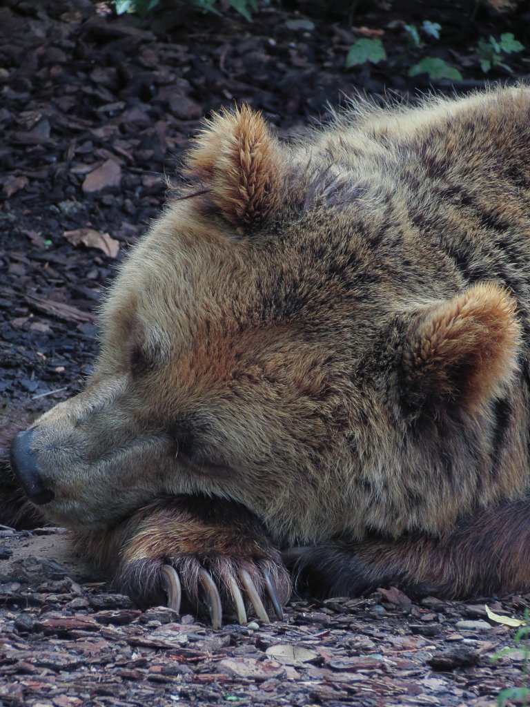
Google’s Fitbit is a smart wristwatch which doesn’t just tell you the time but can also monitor your movements and your heart beat. A particular time of day when your heart beat slows down and you move much less is at night when you’re fast asleep in bed.
Not everyone sleeps well though. Some people struggle to get to sleep and then wake up often during the night and so they feel tired during the day. The FitBit’s “Sleep Profiles” is an AI-supported sleep tracking tool (available to Premium subscribers) that may be able to help them. If the sleeper regularly wears their watch in bed it can monitor their sleep and build up a picture of how long it takes them to fall asleep, how often they wake up and offer some suggestions on how to get a better night’s rest.
So far Google has analysed 22 billion hours of sleep data from Fitbit users (who all agree to share their information so that they and everyone else can benefit from that shared knowledge). They used unsupervised machine learning to find out more about the data. This method gives an artificial intelligence lots of information but doesn’t tell it what to do with it. Instead they asked the AI to cluster groups of data together for the scientists to analyse and interpret. The result was six clusters of data showing the most common different ways that people sleep.
To make it easy for users to understand what the data meant, and how closely their own sleep pattern matched one of the clusters, Fitbit named each cluster after an animal. They took a bit of care over selecting animals to use as they wanted people to have more positive associations (no one wants to be called a sloth for example!) and came up with bear 🐻 tortoise 🐢dolphin 🐬giraffe 🦒parrot 🦜and hedgehog 🦔. People’s ‘sleep animals’ don’t stay the same though (just like our sleep) and you might be a dolphin one month and a tortoise the next. Tortoise-sleepers spend longer in bed but also take longer to fall asleep, and dolphin-sleepers sleep very lightly and tend to spend more time awake in bed.
Elena Perez, one of the product managers for Fitbit, said that parents of little children had told her that they’d seen the icon of the sleeping animal appear on their parents’ watch and knew that it was time to go to bed. Sweet dreams…
Did you know?
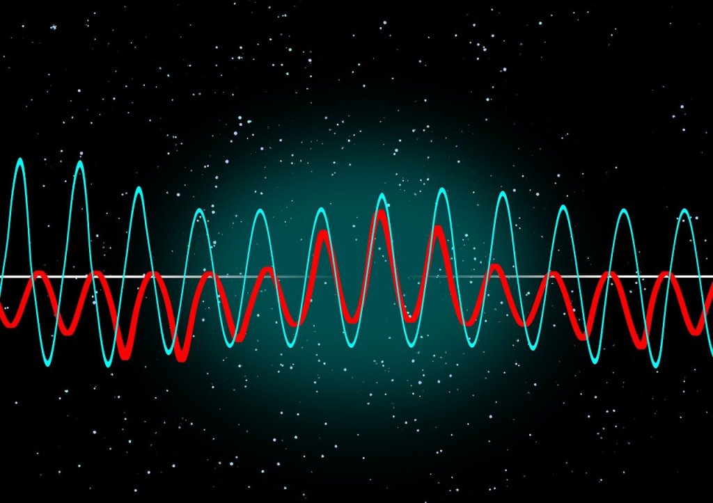
Dolphins and many birds use ‘unihemispheric sleep’ which means that one half of their brain (like humans their brains are also divided into two hemispheres) falls asleep first and the other stays awake. Then the hemispheres swap over!
Polina Bayvel, Professor of Optical Communications, at UCL, and her team have just set a new speed record for sending data over real-world optical cable. They managed to send about 10 times more data than the best commercial services. Remarkable this was without changing the cable or other core infrastructure: the record was set over existing fiber running through a city centre with all the interference that causes, and with all the grime, wear and tear that comes with real use.
What was the secret? Commercial fibre optics typically use wavelengths of 850, 1300 and 1550 nanometers. That is infrared light, which some animals can see, including some snakes, fish and insects (and vampire bats). However, we need special cameras that convert it to the visible range before we can see infrared. What we can do though is create lasers that send pulses of infrared at these wavelengths. We can also design hardware that turns infrared pulses back into data. Polina’s team developed special hardware that could send data over a much larger range of frequencies of light than the existing commercial systems. It used a range of wavelengths of light between 1264 and 1618 nanometers. By mixing these higher wavelengths together they could send more data at the same time – but that is only useful if their hardware could extract the separate signals from the mixed up mess of them, back at the end. The test showed that their hardware could do that in the real-world conditions of sending data from their lab in central London out to a data centre at Canary Wharf over the existing cables, and back, so around 10 miles in total.
It means that in future we will be able to send far more data over existing cable networks with no need to replace the cables, so avoiding the extra time and costs (never mind the road works). The speed of 450 terabits per second is enough to stream 50 million films at the same time. No one actually needs to do that of course. However, our technologies do seem to voraciously use up whatever capacity we create, and with the ever-increasing use of AI tools and their need for masses of data, it may well be this ability to send more data is needed sooner than we might think.
Tony Stockman, who was blind from birth, was a Senior Lecturer at QMUL until his retirement. A leading academic in the field of sonification of data, turning data into sound, he eventually became the President of the “International Community for Auditory Display”: the community of researchers working in this area.
Traditionally, we put a lot of effort into finding the best ways to visualise data so that people can easily see the patterns in it. This is an idea that Florence Nightingale, of lady of the lamp fame, pioneered with Crimean War data about why soldiers were dying. Data visualisation is considered so important it is taught in primary schools where we all learn about pie charts and histograms and the like. You can make a career out of data visualisation, working in the media creating visualisations for news programmes and newspapers, for example, and finding a good visualisation is massively important working as a researcher to help people understand your results. In Big Data a good visualisation can help you gain new insights into what is really happening in your data. Those who can come up with good visualisations can become stars, because they can make such a difference (like Florence Nightingale, in fact)
Many people of course, Tony included cannot see, or are partially sighted, so visualisation is not much help! Tony therefore worked on sonifying data instead, exploring how you can map data onto sounds rather than imagery in a way that does the same thing.: makes the patterns obvious and understandable.
His work in this area started with his PhD where he was exploring how breathing affects changes in heart rate. He first needed a way to both check for noise in the recording and then also a way to present the results so that he could analyse and so understand them. So he invented a simple way to turn data into sound using for example frequencies in the data to be sound frequencies. By listening he could find places in his data where interesting things were happening and then investigate the actual numbers. He did this out of necessity just to make it possible to do research but decades later discovered there was by then a whole research community by then working on uses of and good ways to do sonification,
He went on to explore how sonification could be used to give overviews of data for both sighted and non-sighted people. We are very good at spotting patterns in sound – that is all music is after all – and abnormalities from a pattern in sound can stand out even more than when visualised.
Another area of his sonification research involved developing auditory interfaces, for example to allow people to hear diagrams. One of the most famous, successful data visualisations was the London Tube Map designed by Harry Beck who is now famous as a result because of the way that it made the tube map so easy to understand using abstract nodes and lines that ignored distances. Tony’s team explored ways to present similar node and line diagrams, what computer scientist’s call graphs. After all it is all well and good having screen readers to read text but its not a lot of good if all it tells you reading the ALT text that you have the Tube Map in front of you. And this kind of graph is used in all sorts of every day situations but are especially important if you want to get around on public transport.
There is still a lot more to be done before media that involves imagery as well as text is fully accessible, but Tony showed that it is definitely possible to do better, He also showed throughout his career that being blind did not have to hold him back from being an outstanding computer scientists as well as a leading researcher, even if he did have to innovate himself from the start to make it possible.
Big companies know far more about you than you think. You have very little privacy from their all-seeing algorithms. They may even have worked out some very, very personal things about you, that even your parents don’t know…
An outraged father in Minneapolis stormed into a supermarket chain complaining that his school-aged daughter was being sent coupons for baby clothes. The shop manager apologised … but later they found there was no mistake in the tiny tot offers. The teenager was expecting a baby but had not told her father. Her situation was revealed not by a crystal ball but by an algorithm. The shop was using Big Data processing algorithms that noticed patterns in her shopping that they had linked to “pregnant”. They had even worked out her likely delivery date. Her buying habits had triggered targeted marketing.
Algorithms linked her shopping patterns to “pregnant”
When we use a loyalty card or an online account our sales activity is recorded. This data is added to a big database, with our details, the time, date, location and products bought (or browsed). It is then analysed. Patterns in behaviour can be tracked, our habits, likes, dislikes and even changes in our personal situation deduced, based on those patterns. Sometimes this seems quite useful, other times a bit annoying, it can surprise us, and it can be wrong.
This kind of computing is not just used to sell products, it is also used to detect fraud and to predict where the next outbreak of flu will happen. Our banking behaviour is tracked to flag suspicious transactions and help stop theft and money laundering. When we search for ‘high temperature’ our activity might be added to the data used to predict flu trends. However, the models are not always right as there can be a lot of ‘noise’ in the data. Maybe we bought baby clothes as a present for our aunt, and were googling temperatures because we wanted to go somewhere hot for our holiday.
Whether the predictions are spot on or not is perhaps not the most important thing. Maybe we should be considering whether we want our data saved, mined and used in these ways. A predictive pregnancy algorithm seems like an invasion of privacy, even like spying, especially if we don’t know about it. Predictive analytics is big; big data is really big and big business wants our data to make big profits. Think before you click!
Jane Waite, Queen Mary University of London (now at Raspberry Pi)
In the 2025 RHS Chelsea Flower Show there was one garden that was about technology as well as plants: The Avanade Intelligent Garden exploring how AI might be used to support plants. Each of the trees contained probes that sensed and recorded data about them which could then be monitored through an App. This takes pioneering research from over two decades ago a step further, incorporating AI into the picture and making it mainstream. Back then a team led by Yvonne Rogers built an ambient wood aiming to add excitement to a walk in the woods...
Mark Weiser had a dream of ‘Calm Computing’ and while computing sometimes seems ever more frustrating to use, the ideas led to lots of exciting research that saw at least some computers disappearing into the background. His vision was driven by a desire to remove the frustration of using computers but also the realization that the most profound technologies are the ones that you just don’t notice. He wanted technology to actively remove frustrations from everyday life, not just the ones caused by computers. He wrote of wanting to “make using a computer as refreshing as taking a walk in the woods.”
Not calm, but engaging and exciting!
No one argues that computers should be frustrating to use, but Yvonne Rogers, then of the Open University, had a different idea of what the new vision could be. Not calm. Anything but calm in fact (apart from frustrating of course). Not calm, but engaging and exciting!
Her vision of Weiser’s tranquil woods was not relaxing but provocative and playful. To prove the point her team turned some real woods in Sussex into an ‘Ambient Wood’. The ambient wood was an enhanced wood. When you entered it you took probes with you, that you could point and poke with. They allowed you to take readings of different kinds in easy ways. Time hopping ‘Periscopes’ placed around the woods allowed you to see those patches of woodland at other times of the year. There was also a special woodland den where you could then see the bigger picture of the woods as all your readings were pulled together using computer visualisations.
Not only was the Ambient Wood technology visible and in your face but it made the invisible side of the wood visible in a way that provoked questions about the wildlife. You noticed more. You saw more. You thought more. A walk in the woods was no longer a passive experience but an active, playful one. Woods became the exciting places of childhood stories again but now with even more things to explore.
The idea behind the Ambient Wood, and similar ideas like Bristol’s Savannah project, where playing fields are turned into African Savannah, was to revisit the original idea of computers but in a new context. Computers started as tools, and tools don’t disappear, they extend our abilities. Tools originally extended our physical abilities – a hammer allows us to hit things harder, a pulley to lift heavier things. They make us more effective and allow us to do things a mere human couldn’t do alone. Computer technology can do a similar thing but for the human intellect…if we design them well.
“The most important thing the participants gained was a sense of wonderment at finding out all sorts of things and making connections through discovering aspects of the physical woodland (e.g., squirrel’s droppings, blackberries, thistles)”
– Yvonne Rogers
The Weiser dream was that technology invisibly watches the world and removes the obstacles in the way before you even notice them. It’s a little like the way servants to the aristocracy were expected to always have everything just right but at the same time were not to be noticed by those they served. The way this is achieved is to have technology constantly monitoring, understanding what is going on and how it might affect us and then calmly fixing things. The problem at the time was that it needs really ‘smart’ technology – a high level of Artificial Intelligence to achieve and that proved more difficult than anyone imagined (though perhaps we are now much closer than we were). Our behaviour and desires, however, are full of subtlety and much harder to read than was imagined. Even a super-intellect would probably keep getting it wrong.
There are also ethical problems. If we do ever achieve the dream of total calm we might not like it. It is very easy to be gung ho with technology and not realize the consequences. Calm computing needs monitors – the computer measuring everything it can so it has as much information as possible to make decisions from (see Big Sister is Watching You).
A classic example of how this can lead to people rejecting technology intended to help is in a project to make a ‘smart’ residential home for the elderly. The idea was that by wiring up the house to track the residents and monitor them the nurses would be able to provide much better care, and relatives be able to see how things were going. The place was filled with monitors. For example, sensors in the beds measured resident’s weight while they slept. Each night the occupants weight could invisibly be taken and the nurses alerted of worrying weight loss over time. The smart beds could also detect tossing and turning so someone having bad nights could be helped. A smart house could use similar technology to help you or I have a good nights sleep and help us diet.
The problem was the beds could tell other things too: things that the occupants preferred to keep to themselves. Nocturnal visitors also showed up in the records. That’s the problem if technology looks after us every second of the day, the records may give away to others far more than we are happy with.
Yvonne’s vision was different. It was not that the computers try to second-guess everything but instead extend our abilities. It is quite easy for new technology to lead to our being poorer intellectually than we were. Calculators are a good example. Yes, we can do more complex sums quickly now, but at the same time without a calculator many people can’t do the sums at all. Our abilities have both improved and been damaged at the same time. Generative AI seems to be currently heading the same way, What the probes do, instead, is extend our abilities not reduce them: allowing us to see the woods in a new way, but to use the information however we wish. The probes encourage imagination.
The alternative to the smart house (or calculator) that pampers allowing your brain to stay in neutral, or the residential home that monitors you for the sake of the nurses and your relatives, is one where the sensors are working for you. Where you are the one the bed reports to helping you to then make decisions about your health, or where the monitors you wear are (only) part of a game that you play because its fun.
What next? Yvonne suggested the same ideas could be used to help learning and exploration in other ways, understanding our bodies: “I’d like to see kids discover new ways of probing their bodies to find out what makes them tick.”
So if Yvonne’s vision is ultimately the way things turn out, you won’t be heading for a soporific future while the computer deals with real life for you. Instead it will be a future where the computers are sparking your imagination, challenging you to think, filling you with delight…and where the woods come alive again just as they do in the storybooks (and in the intelligent garden).
– Paul Curzon, Queen Mary University of London
(adapted from the archive)
Subscribe to be notified whenever we publish a new post to the CS4FN blog.
This blog is funded by EPSRC on research agreement EP/W033615/1.
Video games can be a very successful way to do citizen science, getting ordinary people involved in research. Sea Hero Quest is an extremely successful example. It involves a boy setting out on a sea quest to recover his father’s memories, lost when he suffers from dementia. The hundreds of thousands of people joining the quest have helped researchers better understand our ability to navigate.
The Sea Hero Quest project was led by Deutsche Telecom, working with both universities and Alzheimer’s Research UK. The first mass-market game of its kind, it has allowed researchers to explore navigation and related cognitive abilities of people throughout their lives. The game has 75 levels, each with different kinds of task in different environments, and has been played by millions of people around the world for over a 100 years of combined game time. The amount of data collected is vast and would have taken researchers centuries to collect by traditional means, if possible at all.
For example, an international team including researchers from UCL, the University of Lyon and the University of Münster used the game to explore how the place people grew up affects their ability to navigate. As well as more general data from around 400,000 people across the world, they also used the data specifically from people who had completed all levels of the game. This amounted to around ten thousand adults of all ages.
They found that people are best at navigating in situations similar to where they grew up (where they lived at the time of playing the game had no effect). So, for example, people who grew up in an American grid-like city such as Chicago, were better at navigating in grid-based levels. Those who grew up in cities such as Prague in Europe, where the streets are more wiggly and chaotically laid out, were better at levels needing similar navigation skills. Throughout, the researchers found that those that grew up in the countryside were better at navigating overall as well as specifically in more unstructured environments.
Sea Hero Quest shows that games designers, if they can create fun but serious games, can help us all help researchers…It is often said that playing video games is bad for growing brains but it also shows that the way we design our cities affects the way we think and can be bad for our brains!
Herman Hollerith (Image from wikimedia, Public Domain)
Herman Hollerith, the son of immigrants, struggled early on at school and then later in bookkeeping at college but it didn’t stop him inventing machines that used punch cards to store data. He founded a company to make and sell his machines. It turned into the company now called IBM, which of course helped propel us into the computer age.
Hollerith had worked as a census clerk for a while, and the experience led to his innovation. The United States has been running a national census every 10 years since the American Revolution, aiming to record the details of every person, for tax and national planning purposes. It is not just a count but has recorded information about each person such as male/female, married or not, ethnicity, whether they can read, disabilities, and so on.
As the population expanded it of course became harder to do. It was also made harder as more data about each person was being collected over time. For the 1890 census a competition was held to try and find better ways to compile the data collected. Herman Holerith won it with his punch card based machine. It could process data up to twice as fast as his competitors and with his system data could be prepared 10 times faster.
To use the machine, the census information for each person was recorded by punching holes in special cards at specific positions. It was a binary system with a hole essentially meaning the specific feature was present (eg they were married) and no hole meaning it wasn’t (eg they were single). Holes against numbers could also mean one of several options.
Hollerith punched card (Image from wikimedia, Public Domain)
The machine could read the holes because they allowed a wire to make an electrical connection to a pool of mercury below so the holes just acted as switches. Data could therefore be counted automatically, with each hole adding one to a different counter. It was the first time that a system of machine-readable data had been used and of course binary went on to be the way all computers store information. In processing the census his machines counted the data on around 100 million cards (an early example of Big Data processing!). This contributed to reducing the time it took to compile the data from the whole country by two years. It also saved about $5 million
Holerith patented the machine and was also awarded a PhD for his work on it. He set up a company to sell it called the Tabulating Machine Company. Over time it merged with other companies until eventually in 1924 the resulting company changed its name to International Business Machines or is it is now known, IBM. it is of course one of the most important companies driving the computer age, building early mainframe computers the size of rooms that revolutionised business computing, but later also responsible for the personal computer, leading to the idea that everyone could own a computer.
Not a bad entrepreneurship legacy for someone who early on at school apparently struggled with, and certainly hated, spelling – he jumped out of a window at school to avoid doing it. He also did badly at bookkeeping in college. He was undeterred by what he was poor at though and focussed on what he was good at, He was hard working and developed his idea for a mechanical tabulating machine for 8 years before his first machine went to work. Patience and determination was certainly a strength that paid off for him!
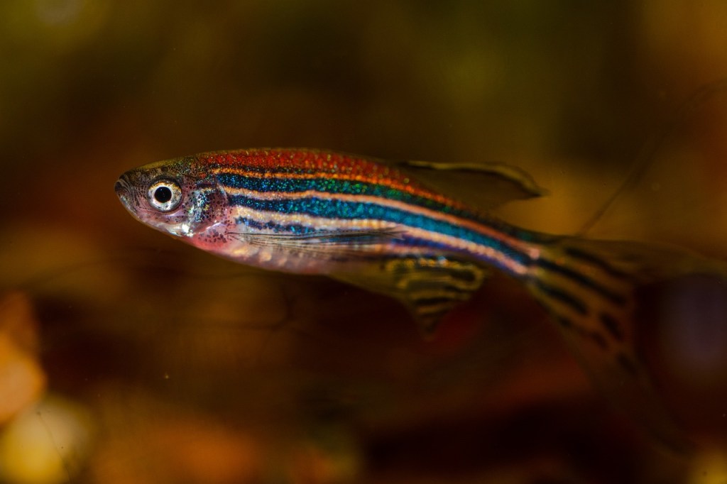
Biologists often analyse data about the cell biology of living animals to understand their development. A large part of this involves looking for patterns in the data to use to refine their understanding of what is going on. The trouble is that patterns can be hard to spot when hidden in the vast amount of data that is typically collected. Humans are very good at spotting patterns in sound though – after all that is all music is. So why not turn the data into sound to find these biological patterns?
In hospitals, the heartbeats of critically ill patients are monitored by turning the data from heart monitors into sounds. Under the sea, in (perhaps yellow) submarines, “golden ear” mariners use their listening talent to help with navigation and detect potential danger for fish and the submarine. They do this by listening to the soundscapes produced by sonar built up from echoes from the objects round about. This way of using sounds to represent other kinds of data is called ‘sonification’. Perhaps similar ideas can help to find patterns in biological data? An interdisciplinary team of researchers from Queen Mary including biologist Rachel Ashworth, Audio experts Mathieu Barthet and Katy Noland and computer scientist William Marsh tried the idea out on the zebrafish. Why zebrafish? Well, they are used lots for the study of the development of vertebrates (animals with backbones). In fact it is what is called a ‘model organism’: a creature that lots of people do research on as a way of building a really detailed understanding of its biology. The hope is that what you learn about zebrafish will help you understand the biology of other vertebrates too. Zebrafish make a good model organism because they mature very quickly. Their embryos are also transparent. That is really useful when doing experiments because it means you can directly see what is going on inside their bodies using special kinds of microscopes.
The particular aspect of zebrafish biology the Queen Mary team has been investigating is the way calcium signals are used by the body. Changes in the concentration of calcium ions are important as they are used inside a cell to regulate its behaviour. These changes can be tracked in zebrafish by injecting fluorescent dyes into cells. Because the zebrafish embryos are transparent whatever has been fluorescently labelled can then be observed.
Calcium ions are used inside a cell to regulate its behaviour
The Queen Mary team developed software that detects calcium changes by automatically spotting the peaks of activity over time. They relied on a technique that is used in music signal processing to detect the start of notes in musical sequences. Finding the peaks in a zebrafish calcium signal and the notes from the Beatles’ Day Tripper riff may seem to be light years apart, but from a signal processing point of view, the problems are similar. Both involve detecting sudden burst of energy in the signals. Once the positions of the calcium peaks have been found they can then be monitored by sonifying the data.
What the team found using this approach is that the calcium activity in the muscle cells of zebrafish varies a lot between early developmental stages of the embryo and the late ones. You can have a go at hearing the difference yourself – listen to the sonified versions of the data.
Train timetables are complex. When designing a timetable for railways you have to think about the physical capabilities of the actual train, what stops it needs to make, whether it is carrying passengers or freight, the number of platforms at a station, the gradient of the track, and the placement of passing loops on single-track sections, amongst many other things. Data visualisation can help with timetabling and make sure our railways continue to run on track!
Data visualisation is an important area in computer science. If you had a huge amount of complex data in a spreadsheet, your first thought wouldn’t be to sit down with a cup of tea and spend hours reading through it – instead you might graph it or create an infographic to get a better picture. Humans are very bad at understanding and processing raw data, so we speed up the process by converting it to something easier to understand.
Timetabling is like this – we need to consider the arrival and departure times from all stations for each train. You might have used a (perhaps now) old fashioned paper timetable, with each train as a column, and the times at each station along the rows, like the one below. This is great if you’re a passenger… you can see clearly when your train leaves, and when it gets to your desired destination. If you’re unlucky enough to miss a train, you can also easily scan along to find the next one.
Image by Daniel Gill for CS4FN
Unfortunately, this kind of presentation might be more challenging for timetable designers. In this timetable, there’s a mix of stopping and fast services. You can see which of them are fast based on the number of stations they skip (marked with a vertical line), but, because they travel at different speeds it’s difficult to imagine where they are on the railway line at any one time.
One of the main challenges in railway timetabling, and perhaps the most obvious, is that trains can’t easily overtake slower ones in front of them. it’s this quirk that causes lots of problems. So, if you needed to insert another train into this timetable you would need to consider all the departure times of the trains around it, to make sure there is no conflicts – this is a lot of data to juggle.
But there’s an easier way to visualise these timetables: introducing Marey charts! They represent a railway on a graph, with stations listed vertically, time along the top, and each train represented by a single (bumpy) line. If we take our original timetable from above and convert it to a Marey chart, we get something that looks like this:
Image by Daniel Gill for CS4FN
Though thought to have been invented by a lesser-known railway engineer called Charles Ibry, these charts were popularised by Étienne-Jules Marey, and (perhaps unfairly) take his name.
How does it work?
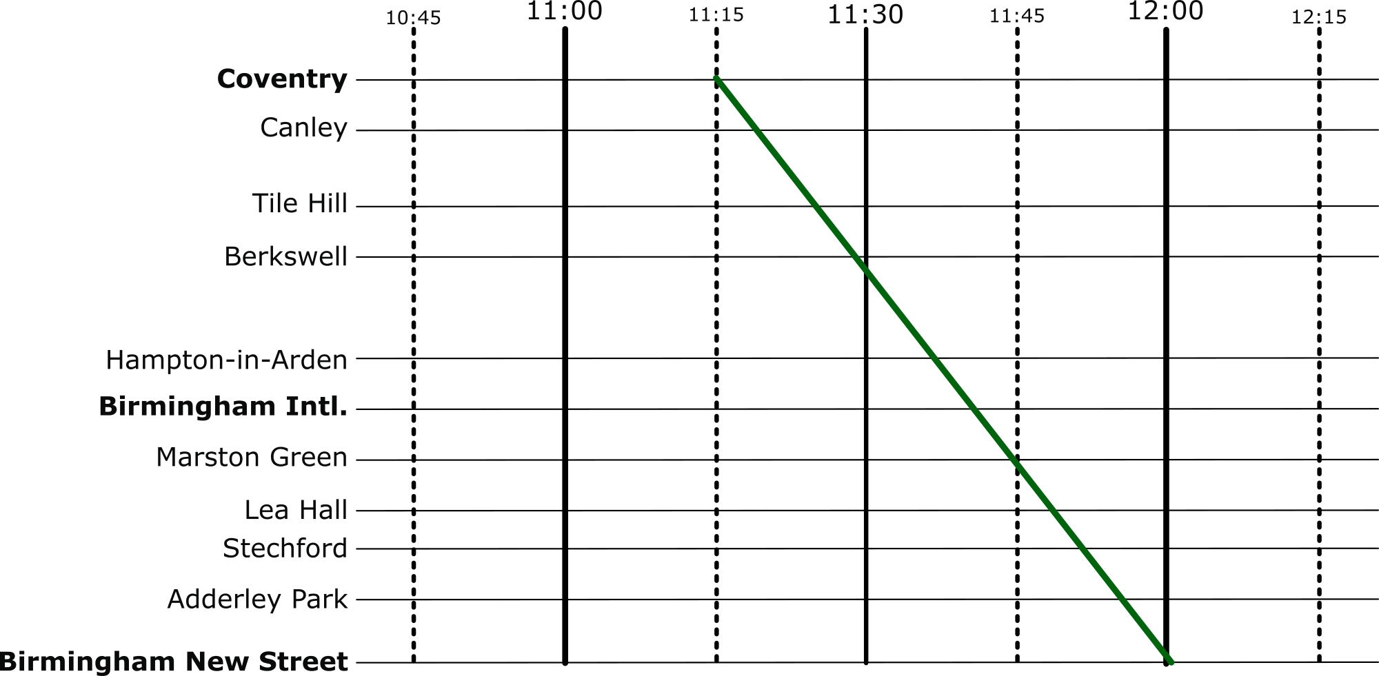
There are a few things that you might notice immediately from this diagram. The stations along the side aren’t equally spaced, like you might expect from other types of graph, instead they are spaced relative to the distance between the stations on the actual railway. This means we can estimate when a fast train will pass each of the stations. This is an estimation, of course, because the train won’t be travelling at a constant speed throughout – but it’s better than our table from before which is no help at all!
Given this relative spacing, we can also estimate how fast a train is going. The steepness of the line, in this diagram, directly reflects the speed of the train*. Look at the dark blue and purple trains – they both leave Coventry really close together, but the purple train is a bit slower, so the gap widens near Birmingham International. We can also see that trains that do lots of stopping (when the line is horizontal) travel at a much slower average speed than the fast ones: though that shouldn’t be a surprise!
*There’s a fun reason that this is the case. The gradient (the steepness of the line) is calculated as the change iny divided by the change in x. In this case, the change in the y dimension is the distance the train has travelled, and the change in x is the time it has taken. If you have studied physics, you might immediately recognise that distance divided by time is speed (or velocity). Therefore, the steepness in a Marey chart is proportional to the speed of the train.
We can also see that the lines don’t intersect at all. This is good, because, quite famously, trains can’t really overtake. If there was an intersection it would mean that at some point, two trains would need to be at the same location at the same time. Unless you’ve invented some amazing quantum train (more about the weirdness of quantum technology in this CS4FN article), this isn’t possible!
Putting it to the Test
Put yourself in the shoes of a railway timetable designer! We have just heard that there is a freight train that needs to run through our little section of railway. The driver needs to head through sometime between 10:45 and 12:15 – how very convenient: we’ve already graphed that period of time.
The difficulty is, though, that their freight train is going to take a very slow 45 minutes to go through our section of railway – how are we going to make it fit? Let’s use the Marey chart to solve this problem visually. Firstly, we’ll put a line on that matches the requirements of the freight train:
Image by Daniel Gill for CS4FN
And then let’s re-enable all the other services.
Image by Daniel Gill for CS4FN
Well, that’s not going to work. We can see from this, though, how slow this freight train actually is, especially compared to the express trains its overlaps with. So, to fix this, we can shift it over. We want to aim for a placement where there are no overlaps at all.
Image by Daniel Gill for CS4FN
Perfect, now it’s not going to be able to make the journey without interfering with our other services at all.
Solving Problems
When we’re given a difficult problem, it’s often a good idea to find a way to visualise it (or as my A-Level physics teacher often reminded me: “draw a diagram!”). This kind of visualisation is used regularly in computer science. From students learning the craft, all the way to programmers and academics at the top of their field – they all use diagrams to help understand a problem.
You might not think of a programming language like Python or Scratch as being an ‘ecosystem’ but each language has its own community of people who create and improve its code (compilers, library code,…), flush out the bugs, introduce new features, document any changes and write the ‘how to’ guides for new users.
R is one such programming language. It’s named after its two co-inventors (Ross Ihaka and Robert Gentleman) and is used by around two million people around the world. People working in all sorts of jobs and industries (for example finance, academic research, government, data journalists) use R to analyse their data. The software has useful tools to help people see patterns in their data and to make sense of that information.
It’s also open source which means that anyone can use it and help to improve it, a bit like Wikipedia where anyone can edit an article or write a new one. That’s generally a good thing because it means everyone can contribute but it can also bring problems. Imagine writing an essay about an event at your school and sharing it with your class. Then imagine your classmates adding paragraphs of their own about the event, or even about different events. Your essay could soon become rather messy and you’d need to re-order things, take bits out and make sure people hadn’t repeated something that someone had already said (but in a slightly different way).
When changes are made to software people also want to keep a note not just of the ‘words’ added (the code) but also to make a note of who added what and when. Keeping good records, also known as documentation, helps keep things tidy and gives the community confidence that the software is being properly looked after.
Code and documentation can easily become a bit chaotic when created by different people in the community so there needs to be a core group of people keeping things in order. Fortunately there is – the ‘R Core Team’, but these days its membership doesn’t really reflect the community of R users around the world. R was first used in universities, particularly by more privileged statistics professors from European countries and North America (the Global North), and so R’s development tended to be more in line with their academic interests. R needs input and ideas from a more diverse group of active developers and decision-makers, in academia and beyond to ensure that the voices of minoritised groups are included. Also the voices of younger people, particularly as many of the current core group are approaching retirement age.
Dr Heather Turner from the University of Warwick is helping to increase the diversity of those who develop and maintain the R programming language and she’s been given funding by the EPSRC* to work on this. Her project is a nice example of someone who is bringing together two different areas in her work. She is mixing software development (tech skills) with community management (people skills) to support a range of colleagues who use R and might want to contribute to developing it in future, but perhaps don’t feel confident to do so yet.
Development can involve things like fixing bugs, helping to improve the behaviour or efficiency of programs or translating error messages that currently appear on-screen in the English language into different languages. Heather and her colleagues are working with the R community to create a more welcoming environment for ‘newbies’ that encourages participation, particularly from people who are in the community but who are not currently represented or under-represented by the core group and she’s working collaboratively with other community organisations such as R-Ladies, LatinR and RainbowR. Another task she’s involved in is producing an easier-to-follow ‘How to develop R’ guide.
There are also people who work in universities but who aren’t academics (they don’t teach or do research but do other important jobs that help keep things running well) and some of them use R too and can contribute to its development. However their contributions have been less likely to get the proper recognition or career rewards compared with those made by academics, which is a little unfair. That’s largely because of the way the academic system is set up.
Generally it’s academics who apply for funding to do new research, they do the research and then publish papers in academic journals on the research that they’ve done and these publications are evidence of their work. But the important work that supporting staff do in maintaining the software isn’t classified as new research so doesn’t generally make it into the journals, so their contribution can get left out. They also don’t necessarily get the same career support or mentoring for their development work. This can make people feel a bit sidelined or discouraged.
To try and fix this and to make things fairer the Society of Research Software Engineering was created to champion a new type of job in computing – the Research Software Engineer (RSE). These are people whose job is to develop and maintain (engineer) the software that is used by academic researchers (sometimes in R, sometimes in other languages). The society wants to raise awareness of the role and to build a community around it. You can find out what’s needed to become an RSE below.
Heather is in a great position to help here too, as she has a foot in each camp – she’s both an Academic and a Research Software Engineer. She’s helping to establish RSEs as an important role in universities while also expanding the diversity of people involved in developing R further, for its long-term sustainability.
Below is an example of a Research Software Engineer role which was advertised at QMUL in April 2024 – you can read the original advert and see a copy of the job description / person specification information which is archived at the “Jobs in Computer Science” website. This advert was looking for an RSE to support a research project “at the intersection of Natural Language Processing (NLP) and multi-modal Machine Learning, with applications in mental health.”
QMUL also has a team of Research Software Engineers and you can read about what they’re working on and their career here (there are also RSEs attached to different projects across the university, as above).
Below are some examples of RSE jobs (these particular vacancies have now closed but you can read about what they were looking for and see if that sort of thing might interest you in the future). The links will take you to a page with the original job advert + any Job Description (JD – what the person would actually be doing) and might also include a Person Specification (PS – the type of person they’re looking for in terms of skills, qualifications and experience) – collectively these are often known as ‘job packs’.
Note that these documents are written for quite a technical audience – the people who’d apply for the jobs will have studied computer science for many years and will be familiar with how computing skills can be applied to different subjects.
1. The Science and Technology Facilities Council (STFC) wanted four Research Software Engineers (who’d be working either in Warrington or Oxford) on a chemistry-related project (‘computational chemistry’ – “a branch of chemistry that uses computer simulation to assist in solving chemical problems”)
2. The University of Cambridge was looking for a Research Software Engineer to work in the area of climate science – “Computational modelling is at the core of climate science, where complex models of earth systems are a routine part of the scientific process, but this comes with challenges…”
3. University College London (UCL) wanted a Research Software Engineer to work in the area of neuroscience (studying how the brain works, in this case by analysing the data from scientists using advanced microscopy).
Subscribe to be notified whenever we publish a new post to the CS4FN blog.
This blog is funded by EPSRC on research agreement EP/W033615/1.