Opinions, Opinions, Opinions

by Paul Curzon, Queen Mary University of London

Based on a talk by Jiayu Song at QMUL, March 2023

Multicoloured speech bubbles with a colourful cross-hairs target in the centre

Social media is full of people’s opinions, whether about politics, movies, things they bought, celebrities or just something in the news. However, sometimes there is just too much of it. Sometimes, you just want an overview without having to read all the separate comments yourself. That is where programs that can summarise text come in. The idea is that they take lots of separate opinions about a topic and automatically give you a summary. It is not an easy problem, however, and while systems exist, researchers continue to look for better ways.

That is what Queen Mary PhD student Jiayu Song is working on with her supervisor, Professor Maria Liakata. Some sources of opinions are easier to work with than others. For example reviews, whether of movies, restaurants or gadgets, tend to be more structured so more alike in the way they are written. Social media posts on the other hand are unlikely to have any common structure. What is written is much more ‘noisy’ and that makes it harder to summarise different opinions. Jiayu is particularly interested in summarising these noisy social media posts, so has set herself the harder problem of the two. 

What does distance of meaning mean?

Think of posts to be summarised as points scattered on a piece of paper. Her work is based on the idea that there is a hypothetical point (so hypothetical social media post) that is in the middle of those other points (a kind of average point) and the task is to find that point so summary post. If they were points on paper then we could use geometry to find a central point that minimises the total distance to all of them. For written text we need first to decide what we actually mean by ‘distance’ as it is no longer something we can measure with a ruler! For text we want some idea of  distance in meaning – we want a post that is as close as possible to those it is summarising but by “close” here we mean close in meaning. What does distance of meaning mean? King and Queen for example might be the same distance apart as boy and girl in meaning whereas tree is further away in meaning.

King and Queen for example might be
the same distance apart as boy and girl in meaning

Jiayu’s approach is based on finding a middle point for posts using a novel (for this purpose) way of determining distance called the Wasserstein distance. It gives a way of calculating distances between distributions of probabilities. Imagine you collected the marks people scored in a test and plotted a graph of how many got each mark. That would give a distribution of marks (likely it would give a hump-like curve known as normal distribution.). This could be used to estimate the distribution of marks you would get from a different class. If we did that for lots of different classes each would actually have a slightly different distribution (so curve when plotted). A summary of the different distributions would be a curve as similar (so as “close”) as possible  to all of them so a better predictor of what new classes might score.

From distance to distribution

You could do a similar thing to find the distribution of words in a book, counting how often each word arises and then plotting a curve of how common the different words are. That distribution gives the probability of different words appearing so could be used to predict how likely a given word was in some new book. For summarising, though it’s not words that are of interest but the meanings of words or phrases, as we want to summarise the meaning whatever the words that were actually used.  If the same thing is expressed using different words, then it should count as the same thing. “The Queen of the UK died today.” and “Today, the British monarch passed away.” are both expressing the same meaning.  It is not the distance apart of individual word meanings we want though, but of distributions of those meanings. Jiayu’s method is therefore first based on extracting the meanings of the words and working out the distribution of those meanings in the posts. However, it turns out it is useful to create two separate representations, one of these distributions of meanings but also another representing the syntax, so the structure of the words actually used too, to help put together the actual final written summary.

Once that decoding stage has been done, creating new versions of the texts to be summarised as distributions, Jiayu’s system uses that special Wasserstein distance to calculate a new distribution of meanings that represents the central point of all those that are being summarised. Even given a way to calculate distances there are different versions of what is meant by “central” point and Jiayu uses a version that helps with the next stage. That involves, a neural network based system, like those used for machine learning systems more generally, is used  to convert the summary distributions back into readable text. That summary is the final output of the program.

Does it work?

She has run experiments to compare the summaries from her approach to existing systems. To do this she took three existing datasets of opinions, one from Twitter combining opinions about politics and covid, a second containing posts from Reddit about covid, and a final one of reviews posted on Amazon. A panel of three experts then individually rated the summaries from Jiayu’s system with those from two existing summarising systems. The experts were also given “gold standard” summaries written by humans to judge all the summaries against. They had to rate which system produced the best and worst summary for each of a long series of summaries produced from the datasets. The expert’s ratings suggested that Jiayu’s system preserved meaning better than the others, though did less well in other categories such as how fluent the output was. Jiayu also found that there was a difference when rating the more structured Amazon reviews compared to the other more noisy social media posts and in these two cases a different approach was needed to decode the summary generated back into actual text based on the extra syntax representation created.

Systems like Jiayu’s, once perfected, could have lots of uses: they could help journalists quickly get on top of opinions being posted of a breaking story, help politicians judge the mood of the people about their policies or just help the rest of us decide which movie to watch or whether we should buy some new gadget or not.

Perhaps you have an opinion of whether that would be useful or not?

More on …

Related Magazines …


EPSRC supports this blog through research grant EP/W033615/1. 

Joyce Wheeler: The Life of a Star

Exploding star

by Paul Curzon, Queen Mary University of London

The first computers transformed the way research is done. One of the very first computers, EDSAC*, contributed to the work of three Nobel prize winners: in Physics, Chemistry and Medicine. Astronomer, Joyce Wheeler was an early researcher to make use of the potential of computers to aid the study of other subjects in this way. She was a Cambridge PhD student in 1954 investigating the nuclear reactions that keep stars burning. This involved doing lots of calculations to work out the changing behaviour and composition of the star.

Exploding star
Star image by Dieter from Pixabay

Joyce had seen EDSAC on a visit to the university before starting her PhD, and learnt to program it from its basic programming manual so that she could get it to do the calculations she needed. She would program by day and let EDSAC number crunch using her programs every Friday night, leaving her to work on the results in the morning, and then start the programming for the following week’s run. EDSAC not only allowed her to do calculations accurately that would otherwise have been impossible, it also meant she could run calculations over and over, tweaking what was done, refining the accuracy of the results, and checking the equations quickly with sample numbers. As a result EDSAC helped her to estimate the age of stars.

*Electronic Delay Storage Automatic Calculator

EDSAC Monitoring Desk, image from Wikipedia

This article was originally published on the CS4FN website and also appears on page 17 of Issue 23 of the CS4FN magazine, The Women are (still) Here. You can download a free copy of the magazine as a PDF below, along with all of our other free material.


Related Magazine …


This blog is funded through EPSRC grant EP/W033615/1.

The Devil is in the Detail: Lessons from Animal Welfare? (Temple Grandin)

Several cows poking their heads through railings to look at the camera.

by Paul Curzon, Queen Mary University of London

Several cows poking their heads through railings to look at the camera.
Cows image by -Rita-👩‍🍳 und 📷 mit ❤ from Pixabay


What can Computer Scientists learn from a remarkable woman and the improvements she made to animal welfare and the meat processing industry?

Temple Grandin is an animal scientist – an animal welfare specialist and a remarkable innovator on top. She has extraordinary abilities that allow her to understand animals in ways others can’t. As a result her work has reduced the suffering of countless farm animals. She has designed equipment, for example, to restrain animals. It makes it easier to give them shots because, in contrast to the equipment it replaces, it does not discomfort the animals as they enter. By being able to see the detail that an animal perceives she is able to design to overcome the problems. Paradoxically perhaps for someone who cares so much about animals, she works with slaughter houses – Meat Processing factories like those of McDonalds.

Her aim, given people do eat meat, is to ensure the animals are treated humanely throughout the process of rearing an animal until its death. Her work has been close to miraculous in the changes she has brought about to ensure that farm animals do not suffer. She is good for business too. If cattle are spooked by something as they enter the processing factory (also known as a ‘plant’), whether by the glint of metal or a deep shadow, the plant’s efficiency drops. Fewer animals are processed per hour and that is a big problem for managers.

As a result of her work she has turned round plants, both in welfare terms and in terms of rescuing plants that might otherwise have been shut down. Suddenly plants she audits are treating their livestock humanely.

See the Bigger Picture

Where do Temple’s extraordinary abilities come from? In fact she was originally labelled as being mentally disabled. She is actually autistic. As a result her brain doesn’t quite work the way most people’s do. Autistic people as a result of these brain differences often have difficulties socialising with others. They can find it very hard to understand the nuances of human-human communication that the rest of us take for granted. This is in part because autistic people perceive the world differently. A non-autistic person misses vast amounts of the detail in front of their eyes. Instead just a bigger picture of what they are seeing is passed to their conscious selves. An autistic person doesn’t have that sub-conscious ability to filter out detail, but instead perceives every small thing all at once. That is why autistics can sometimes be overcome by their surroundings, finding the world too much to cope with. They think in terms of a series of pictures full of detail, not abstractly in words.

Temple Grandin argues that that is what makes her special when it comes to understanding farm animals. In some ways they see the world very much like she does. Just as a cow does, she notices the shadows and the glint of metal, the bright patch on the floor from the overhead lights or the jacket laid over the fence that is spooking it. The plant managers and animal handlers don’t even register them never mind see them as a problem.

Who ya gonna call?

Because of this ability to quickly spot the problems everyone else has missed, Temple gained a reputation for being the person to call when a problem seemed intractable. She has also turned it into a career as an animal welfare auditor, checking processing plants to ensure their standards are sufficiently high. This is where she has helped force through the biggest improvements, and it all boils down to checklists.


Tick that box

Checking that lists of guidelines are being adhered to is a common way to audit quality in many areas of life. Checklists are used in a computer science context as checks for usability (for example that a new version of some application is easy to use) and accessibility (could a blind person, or for that matter someone who was autistic, successfully use a website say). Checklists tend to be very long. After all it must be the case that the more you are checking, the higher the quality of the result, mustn’t it? Surprisingly that turns out not always to be true! That is why Temple Grandin has been so successful. Rather than have a checklist with hundreds of things to check she boiled her own set of questions to ask down to just 10.

Traditional animal welfare audits have checklist questions such as “Is the flooring slippery?” and “Is the electric prod used as little as possible?”. Even apart from the number to work through this kind of checklist can be very hard to follow, not least due to the vagueness.

Ouch!

Temple’s checklist includes questions like: “Do all animals remain unconscious after being stunned?”, “Do no more than 3% of animals vocalise during handling or stunning?” (a “Moo” in this situation means “Ouch”) They are precise, with little room for dispute – it isn’t left to the inspectors judgement. That also means everyone knows the target they are working towards. The fact that there are only 10 also means it is easy for everyone involved to know them all well. Perhaps most importantly they do not focus on the state of the factory, or the way things are done. Instead, they focus on the end results – that animals are humanely treated. The point is that one item covers a multitude of sins that could be causing it. If too many animals are crying out in pain then you have to fix ALL the causes, even if it is something new that no-one thought of putting on a checklist before.

Temple’s 10 point approach to checklists can apply to more than just animal welfare of course. The principles behind it could just as well apply to other areas like usability and accessibility of websites.

Some usability evaluation techniques do follow similar principles. Cognitive Walkthrough, a method of auditing that systems are easy to use on first encounter, has some of the features of this kind of approach. The original version involved a longish set of questions that an expert was to ask him/herself about a system under evaluation. After early trials the developers of the method Cathleen Wharton, John Rieman, Clayton Lewis and Peter Polson quickly realised this wasn’t very practical and replaced it by a 4 question version. It has since then even been replaced by a 3-question walkthrough. One of the questions, to be asked of each step in achieving a task, is: “Will a user know what to try and do at this point?” This has some of the flavour of the Grandin approach – it is about the end result not about some specific thing going wrong.

Let’s look at accessibility. Currently, where web designers think about it at all (UK law requires them to) the long checklist approach tends to be followed. Typical items to check are things like “Ensure that all information conveyed with colour is also available without colour”. Automatic systems are often used to do audits. That is good in one sense as the criteria have then to be very precise for a mere computer to make the decision. On the other hand it encourages items in the checklist to just be things a computer can check. It also encourages the long list of fine detail approach that Temple rejected. Worse, it also can lead to people conforming to the checklist without deeply understanding what the point actually is. A classic example is a web designer adding as the last item on a web page “If you are partially sighted click here”. As far as an automatic checker is concerned they may have done everything right – even providing alternative facilities that are clearly available (if you can see them). A partially sighted person however would only get to that instruction on the screen after they have struggled through the rest of the page. The designer got the right idea but missed the point.

Temple Grandin’s approach would suggest instead having checklists that ask about the outcomes of using the page: “Do 97% of partially-sighted people successfully complete their objective in using the site?” for example. That is why “user testing” is so important, at least as one of the evaluation approaches you follow. User testing involves people from a wide variety of backgrounds actually trying using your prototype software or web pages before they are released. It allows you to focus on the big picture. Of course if you are trying to ensure a web page is accessible your users must include people with different kinds of disabilities.


The Big Picture

One of Temple Grandin’s main messages is that the big advantage that arises as a result of her autism is that she thinks in concrete pictures not in abstract words. Whilst thinking verbally is good in some situations it seems to make us treat small things as though they were just as important as the big issues.

So whatever you are doing, whether looking after animals or designing accessible websites, don’t get lost in the detail. Focus on the point of it all.


This article was originally published on the CS4FN website. You might also like to read I’m feeling Moo-dy today.


This blog is funded through EPSRC grant EP/W033615/1.

Ingrid Daubechies: Wiggly lines help catching crime

by Paul Curzon, Queen Mary University of London

from the cs4fn women are here special issue.

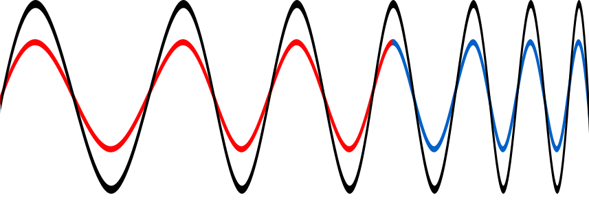
Blue and yellow sine wave patterns representing light

Computer scientists rely on maths a lot. As mathematicians devise new mathematical theories and tools, computer scientists turn them into useful programs. Mathematicians who are interested in computing and how to make practical use of their maths are incredibly valuable. Ingrid Daubechies is like that. Her work has transformed the way we store images and much besides. She works on the maths behind digital signal processing – how best to manipulate things like music and images in computers. It boils down to wiggly lines.

Pixel pictures

The digital age is founded on the idea that you can represent signals: whether sound or images, radio waves, or electrical signals, as sequences of numbers. We digitise things by breaking them into lots of small pieces, then represent each piece with a number. As I look out my window, I see a bare winter tree, with a robin singing. If I take a picture with a digital camera, the camera divides the scene into small squares (or pixels) and records the colour for each square as a number. The real world I’m looking at isn’t broken into squares, of course. Reality is continuous and the switch to numbers means some of the detail of the real thing is lost. The more pieces you break it into the more detail you record, but when you blow up a digital image too much, eventually it goes blurry. Reality isn’t fuzzy like that. Zoom in on the real thing and you see ever more detail. The advantage of going digital is that, as numbers, the images can be much more quickly and easily stored, transmitted and manipulated by Photoshop-like programs. Digital signal processing is all about how you store and manipulate real-world things, those signals, with numbers.

Curvy components

There are different ways to split signals up when digitising them. One of the bedrocks of digital signal processing is called Fourier Analysis. It’s based on the idea that any signal can be built out of a set of basic building blocks added together. It’s a bit like the way you can mix any colour of paint from the three primary colours: red, blue and yellow. By mixing them in the right proportions you can get any colour. That means you can record colours by just remembering the amounts of each component. For signals, the building blocks are the pure frequencies in the signal. The line showing a heartbeat as seen on a hospital monitor, say, or a piece of music in a sound editing program, can be broken down into a set of smooth curves that go up and down with a given frequency, and which when added together give you the original line – the original signal. The negative parts of one wave can cancel out positive parts of another just as two ripples meeting on a pond combine to give a different pattern to the originals.

This means you can store signals by recording the collection and strength of frequencies needed to build them. For images the frequencies might be about how rapidly the colours change across the image. An image of say a hazy sunset, where the colours are all similar and change gradually, will then be made of low frequencies with rolling wave components. An image with lots of abrupt changes will need lots of high frequency, more spiky, waves to represent all those sudden changes.

Blurry bits

Now suppose you have taken a picture and it is all a bit blurry. In the set of frequencies that blurriness will be represented by the long rolling waves across the image: the low frequencies. By filtering out those low frequencies, making them less important and making the high frequency building blocks stronger, we can sharpen the image up.

more like keyhole surgery on a signal
than butchering the whole thing.

By filtering in different ways we can have different effects on the image. Some of the most important help compress images. If a digital camera divides the image into fewer pixels it saves memory by storing less data, but you end up with blocky looking pictures. If you instead throw away information by losing some of the frequencies of a Fourier version, the change may be barely noticeable. In fact, drawing on our understanding of how our brains process the world to choose what frequencies to drop we might not see a change in the image at all.

The power of Fourier Analysis is that it allows you to manipulate the whole image in a consistent way, editing a signal by editing its frequency building blocks. However, that power is also a disadvantage. Sometimes you want to have effects that are more local – doing something that’s more like keyhole surgery on a signal than butchering the whole thing.

Wiggly wavelets

A pulse signal on a spherical monitor surface
Image by Gerd Altmann from Pixabay 

That is where wavelets come in. They give a way of focussing on small areas of the signal. The building blocks used with wavelets are not the smooth, forever undulating curves of Fourier analysis, but specially designed functions, ie wiggly lines, that undulate just in a small area – a bit like a single heart beat signal. A ‘mother’ wavelet is combined with variations of it (child wavelets) to make the full set of building blocks: a wavelet family.

Wavelets were perhaps more a curiosity than of practical use to computer scientists, until Ingrid Daubechies came up with compact wavelets that needed only a fixed time to process. The result was a versatile and very practical tool that others have been able to use in all sorts of ways. For example, they give a way to compress images without losing information that matters. This has made a big difference with the FBI’s fingerprint archive, for example. A family of wavelets allows each fingerprint to be represented by just a few wavelets, so a few numbers, rather than the many numbers needed if pixels were stored. The size of the collection takes up 20 times less storage space as wavelets without corrupting the images. That also means it can be sent to others who need it more easily. It matters when each fingerprint would otherwise involve storing or sending 10 Megabytes of data.

People have come up with many more practical uses of Wavelets, from cleaning up old music to classifying stars and detecting earthquakes. Not bad for a wiggly line.

More on …

Related Magazines …


EPSRC supports this blog through research grant EP/W033615/1. 

Mark Dean: An Inspiration

by Dean Miller, former student QMUL

From the archive: This article is an edited version of one of the 2006 winning essays from the Queen Mary University of London, Department of Computer Science, first year essay competition.

Mark Dean

May I ask you a question? When you think of the computer what names ring a bell? Bill Gates? Or for those more in touch with the history behind computers maybe Charles Babbage is a familiar name? May I ask you another question please? Do you know who Dr Mark Dean is? No, well you should. Do not worry yourself though, you are definitely not alone. I did not know of him either.

Allow me to enlighten you..

Mark Dean is in my opinion a very creative and inspirational black computer scientist. He is a vice-president at IBM and holds 3 of IBM’s first 9 patents on the personal computer. He has over 30 patents pending. He won the Black Engineer of the Year Presidents Award and was made an IBM fellow in 1995. An IBM fellow is IBM’s highest technical honor. Only 50 of IBM’s employee’s are fellows and Mark Dean was the first black one. Prior to joining IBM in 1980 he earned degrees in Electrical Engineering before going back to school to gain a PhD in the field from Stanford University. He was born in 1957 in Jefferson City, Tennessee and was one of the first black students to attend Jefferson City High School. He was an exceptional student and enjoyed athletics. Early manifestations of his desire to create were shown when he and his father built a tractor from scratch when he was just a boy.

Upon joining IBM Mark Dean and a partner led the team that developed the interior architecture (ISA systems bus) which allowed devices like the keyboard and printer to be connected to the motherboard making computers a part of our lives. It was that which earned him a spot in the National Inventors Hall of Fame. While at IBM he has been involved in numerous positions in computer system hardware architecture and design. He was responsible for IBM’s research laboratory in Austin, Texas where he focused on developing high performance microprocessors, software, systems and circuits. It is here where he made history by leading the team that built a gigahertz chip which did a billion calculations per second. In 2004, he was chosen as one of the 50 most important Blacks in Research Science.

He and his father built a tractor
from scratch when he was just a boy

I think that such a man should be well recognized in computer science, especially to black computer science students because from what I can see we are rare. We as a minority need an inspirational figure like Mark Dean. He inspires me, I wanted to share that with you. Before this small article it is very probable you had no knowledge of this man. So if there comes a time where you are asked about important names in the field of computers, I hope Dr Mark Dean springs to mind and rings a bell for you to hear loud and clear.


This blog is funded through EPSRC grant EP/W033615/1.

100,000 frames – quick draw: how computers help animators create

Film projector with film strip on a coloured rainbow background, from Pixabay

Ben Stephenson of the University of Calgary gives us a guide to the basics of animation.

Film projector with film strip on a coloured rainbow background, from Pixabay
Film projector and film strip image by Gerd Altmann from Pixabay

Animation isn’t a new field – artists have been creating animations for over a hundred years. While the technology used to create those animations has changed immensely during that time, modern computer generated imagery continues to employ some of the same techniques that were used to create the first animations.

The hard work of hand drawing

During the early days of animation, moving images were created by rapidly showing a sequence of still images. Each still image, referred to as a frame, was hand drawn by an artist. By making small changes in each new frame, characters were created that appeared to be walking, jumping and talking, or doing anything else that the artist could imagine.

In order for the animation to appear smooth, the frames need to be displayed quickly – typically at around 24 frames each second. This means that one minute of animation required artists to draw over 1400 frames. That means that the first feature-length animated film, a 70-minute Argentinean film called The Apostle, required over 100,000 frames to create.

Creating a 90-minute movie, the typical feature length for most animated films, took almost 130,000 hand drawn frames. Despite these daunting numbers, many feature length animated movies have been created using hand-drawn images.

Drawing with data

Today, many animations are created with the assistance of computers. Rather than simply drawing thousands of images of one character using a computer drawing program, artists can create one mathematical model to represent that character, from which all of his or her appearances in individual frames are generated. Artists manipulate the model, changing things like the position of the character’s limbs (so that the character can be made to walk, run or jump) and aspects of the character’s face (so that it can talk and express emotions). Furthermore, since the models only exist as data on a computer they aren’t confined by the physical realities that people are. As such, artists also have the flexibility to do physically impossible things such as shrinking, bending or stretching parts of a character. Remember Elastigirl, the stretchy mum in The Incredibles? All made of maths.

Once all of the mathematical models have been positioned correctly, the computer is used to generate an image of the models from a specific angle. Just like the hand-drawn frames of the past, this computer- generated image becomes one frame in the movie. Then the mathematical models representing the characters are modified slightly, and another frame is generated. This process is repeated to generate all of the frames for the movie.

The more things change

You might have noticed that, despite the use of computers, the process of generating and displaying the animation remains remarkably similar to the process used to create the first animations over 100 years ago. The animation still consists of a collection of still images. The illusion of smooth movement is still achieved by rapidly displaying a sequence of frames, where each frame in the sequence differs only slightly from the previous one.

The key difference is simply that now the images may be generated by a computer, saving artists from hand drawing over 100,000 copies of the same character. Hand-drawn animation is still alive in the films of Studio Ghibli and Disney’s recent The Princess and the Frog, but we wonder if the animators of hand-drawn features might be tempted to look over at their fellow artists who use computers and shake an envious fist. A cramped fist, too, probably.


This article was originally published on the CS4FN website and also appears on page 3 of issue 11 of the CS4FN magazine “Computer animation proudly presents…” which you can download as a free PDF along with all of our other free material at our CS4FN downloads site.


Related Magazine …


This blog is funded through EPSRC grant EP/W033615/1.

Edie Schlain Windsor and same sex marriage

by Paul Curzon, Queen Mary University of London

US Supreme court building
Image by Mark Thomas from Pixabay

Edie Schlain Windsor was a senior systems programmer at IBM. There is more to life than computing though. Just like anyone else, Computer Scientists can do massively important things aside from being very good at computing. Civil rights and over-turning unjust laws are as important as anything. She led the landmark Supreme Court Case (United States versus Windsor) that was a milestone for the rights of same-sex couples in the US.

Born to a Jewish immigrant family, Edie worked her way up from an early data entry job at New York University to ultimately become a senior programmer at IBM and then President of her own software consultancy where she helped LGBTQ+ organisations become computerised.

Having already worked as a programmer at an energy company called Combustion Engineering, she joined IBM on completing her degree in 1958 so was one of the early generation of female programmers, before the later idea of the male programmer stereotype took hold. Within ten years she had been promoted to the highest technical position in IBM, that of a Senior Systems Programmer: so one of their top programmers lauded as a wizard debugger. She had started out programming mainframe computers, the room size computers that were IBM ‘s core business at the time. They both designed and built the computers as well as the operating system and other software that ran on them. Edie became an operating systems expert, and a pioneer computer scientist also working on natural language processing programs, aiming to improve the interactivity of computes. Natural Language Processing was then a nascent area but that by 2011 IBM led spectacularly with its program Watson winning the quiz show Jeopardy! answering general knowledge questions playing against human champions.

Before her Supreme Court case overturned it, a law introduced in 1996 banned US federal recognition of same-sex marriages. It made it federal law that marriage could only exist between a man and a woman. Individual states in the US had introduced same-sex marriage but this new law meant that such marriages were not recognised in general in the US. Importantly, for those involved it meant a whole raft of benefits including tax, immigration and healthcare benefits that came with marriage were denied to same-sex couples.

Edie had fallen in love with psychologist Thea Spyer in 1965, and two years later they became engaged, but actually getting married was still illegal. They had to wait almost 30 years before they were even allowed to make their partnership legal, though still at that point not marry. They were the 80th couple to register on the day such partnerships were finally allowed. By this time Thea had been diagnosed with multiple sclerosis, a disease that gradually leads to the central nervous system breaking down, with movement becoming ever harder. Edie was looking after her as a full time carer, having given up her career to do so. They both loved dancing and did so throughout their life together even once Thea was struggling to walk, using sticks to get on to the dance floor and later dancing in a wheelchair. As Thea’s condition grew worse it became clear she had little time to live. Marriage was still illegal in New York, however, so before it was too late, they travelled to Canada and married there instead.

When Thea died she left everything to Edie in her will. Had Edie been a man married to Thea, she would not have been required to pay tax on this inheritance, but as a woman and because same-sex marriages were deemed illegal she was handed a tax bill of hundreds of thousands of dollars. She sued the government claiming the way different couples were treated was unfair. The case went all the way to the highest court, the Supreme Court, who ruled that the 1996 law was itself unlawful. Laws in the US have as foundation a written constitution that dates back to 1789. The creation of the constitution was a key part of the founding of the United States of America itself. Without it, the union could easily have fallen apart, and as such is the ultimate law of the land that new laws cannot overturn. The problem with the law banning same sex marriage was that it broke the 5th amendment of the constitution added in 1791, one of several amendments made to ensure people’s rights and justice was protected by the constitution.

The Supreme Court decision was far more seismic than just refunding a tax bill, however. It overturned the law that actively banned same-sex marriage, as it fell foul of the constitution, and this paved the way for such marriages to be made actively legal. In 2014 federal employees were finally told they should perform same-sex marriages across the US, and those marriages gave the couple all the same rights as mixed-sex marriages. Because Edie took on the government, the US constitution, and so justice for many, many couples prevailed.

More on …

Related Magazines …

cs4fn issue 14 cover

This blog is funded through EPSRC grant EP/W033615/1.

Understanding matters of the heart – creating accurate computer models of human organs

Colourful depiction of a human heart

by Paul Curzon, Queen Mary University of London

Ada Lovelace, the ‘first programmer’ thought the possibilities of computer science might cover a far wider breadth than anyone else of her time. For example, she mused that one day we might be able to create mathematical models of the human nervous system, essentially describing how electrical signals move around the body. University of Oxford’s Blanca Rodriguez is interested in matters of the heart. She’s a bioengineer creating accurate computer models of human organs.

How do you model a heart? Well you first have to create a 3D model of its structure. You start with MRI scans. They give you a series of pictures of slices through the heart. To turn that into a 3D model takes some serious computer science: image processing that works out, from the pictures, what is tissue and what isn’t. Next you do something called mesh generation. That involves breaking up the model into smaller parts. What you get is more than just a picture of the surface of the organ but an accurate model of its internal structure.

So far so good, but it’s still just the structure. The heart is a working, beating thing not just a sculpture. To understand it you need to see how it works. Blanca and her team are interested in simulating the electrical activity in the heart – how electrical pulses move through it. To do this they create models of the way individual cells propagate an electrical system. Once you have this you can combine it with the model of the heart’s structure to give one of how it works. You essentially have a lot of equations. Solving the equations gives a simulation of how electrical signals propagate from cell to cell.

The models Blanca’s team have created are based on a healthy rabbit heart. Now they have it they can simulate it working and see if it corresponds to the results from lab experiments. If it does then that suggests their understanding of how cells work together is correct. When the results don’t match, then that is still good as it gives new questions to research. It would mean something about their initial understanding was wrong, so would drive new work to fix the problem and so the models.

Once the models have been validated in this way – shown it is an accurate description of the way a rabbit’s heart works – they can use them to explore things you just can’t do with experiments – exploring what happens when changes are made to the structure of the virtual heart or how drugs change the way it works, for example. That can lead to new drugs.

They can also use it to explore how the human heart works. For example, early work has looked at the heart’s response to an electric shock. Essentially the heart reboots! That’s why when someone’s heart stops in hospital, the emergency team give it a big electric shock to get it going again. The model predicts in detail what actually happens to the heart when that is done. One of the surprising things is it suggests that how well an electric shock works depends on the particular structure of the person’s heart! That might mean treatment could be more effective if tailored for the person.

Computer modelling is changing the way science is done. It doesn’t replace experiments. Instead clinical work, modelling and experiments combine to give us a much deeper understanding of the way the world, and that includes our own hearts, work.


This article was originally published on the CS4FN website and a copy can be found on p16 of issue 20 of the CS4FN magazine, a free PDF copy of which can be downloaded by clicking the picture or link below, along with all of our free-to-download booklets and magazines.


Logo for CRY: Cardiac Risk in the Young

The charity Cardiac Risk in the Young raises awareness of cardiac electrical rhythm abnormalities and supports testing (electrocardiograms and echocardiograms) for all young people aged 14-35.


This blog is funded through EPSRC grant EP/W033615/1.

The Dark History of Algorithms

Colourful graphic equaliser cartoon, representing frequencies

Zin Derfoufi, a Computer Science student at Queen Mary, delves into some of the dark secrets of algorithms past.

Algorithms are used throughout modern life for the benefit of mankind whether as instructions in special programs to help disabled people, computer instructions in the cars we drive or the specific steps in any calculation. The technologies that they are employed in have helped save lives and also make our world more comfortable to live it. However, beneath all this lies a deep, dark, secret history of algorithms plagued with schemes, lies and deceit.

Algorithms have played a critical role in some of History’s worst and most brutal plots even causing the downfall and rise of nations and monarchs. Ever since humans have been sent on secret missions, plotted to overthrow rulers or tried to keep the secrets of a civilisation unknown, nations and civilisations have been using encrypted messages and so have used algorithms. Such messages aim to carry sensitive information recorded in such a way that it can only make sense to the sender and recipient whilst appearing to be gibberish to anyone else. There are a whole variety of encryption methods that can be used and many people have created new ones for their own use: a risky business unless you are very good at it.

One example is the ‘Caesar Cipher’ which is named after Julius Caesar who used it to send secret messages to his generals. The algorithm was one where each letter was replaced by the third letter down in the alphabet so A became D, B became E, etc. Of course, it means that the recipient must know of the algorithm (sequence to use) to regenerate the original letters of the text otherwise it would be useless. That is why a simple algorithm of “Move on 3 places in the alphabet” was used. It is an algorithm that is easy for the general to remember. With a plain English text there are around 400,000,000,000,000,000,000,000,000 different distinct arrangements of letters that could have been used! With that many possibilities it sounds secure. As you can imagine, this would cause any ambitious codebreaker many sleepless nights and even make them go bonkers!!! It became so futile to try and break the code that people began to think such messages were divine!

But then something significant happened. In the 9th Century a Muslim, Arabic Scholar changed the face of cryptography forever. His name was Abu Yusuf Ya’qub ibn Ishaq Al-Kindi -better known to the West as Alkindous. Born in Kufa (Iraq) he went to study in the famous Dar al-Hikmah (house of wisdom) found in Baghdad- the centre for learning in its time which produced the likes of Al-Khwarzimi, the father of algebra – from whose name the word algorithm originates; the three Bana Musa Brothers; and many more scholars who have shaped the fields of engineering, mathematics, physics, medicine, astrology, philosophy and every other major field of learning in some shape or form.

Al-Kindi introduced the technique of code breaking that was later to be known as ‘frequency analysis’ in his book entitled: ‘A Manuscript on Deciphering Cryptographic Messages’. He said in his book:

“One way to solve an encrypted message, if we know its language, is to find a different plaintext of the same language long enough to fill one sheet or so, and then we count the occurrences of each letter. We call the most frequently occurring letter the ‘first’, the next most occurring one the ‘second’, the following most occurring the ‘third’, and so on, until we account for all the different letters in the plaintext sample.

“Then we look at the cipher text we want to solve and we also classify its symbols. We find the most occurring symbol and change it to the form of the ‘first’ letter of the plaintext sample, the next most common symbol is changed to the form of the ‘second’ letter, and so on, until we account for all symbols of the cryptogram we want to solve”.

So basically to decrypt a message all we have to do is find out how frequent each letter is in each (both in the sample and in the encrypted message – the original language) and match the two. Obviously common sense and a degree of judgement has to be used where letters have a similar degree of frequency. Although it was a lengthy process it certainly was the most efficient of its time and, most importantly, the most effective.

Colourful graphic equaliser cartoon, representing frequencies
Frequencies image by OpenClipart-Vectors from Pixabay

Since decryption became possible, many plots were foiled changing the course of history. An example of this was how Mary Queen of Scots, a Catholic, plotted along with loyal Catholics to overthrow her cousin Queen Elizabeth I, a Protestant, and establish a Catholic country. The details of the plots carried through encrypted messages were intercepted and decoded and on Saturday 15 October 1586 Mary was on trial for treason. Her life had depended on whether one of her letters could be decrypted or not. In the end, she was found guilty and publicly beheaded for high treason. Walsingham, Elizabeth’s spymaster, knew of Al-Kindi’s approach.

A more recent example of cryptography, cryptanalysis and espionage was its use throughout World War I to decipher messages intercepted from enemies. The British managed to decipher a message sent by Arthur Zimmermann, the then German Foreign Minister, to the Mexicans calling for an alliance between them and the Japanese to make sure America stayed out of the war, attacking them if they did interfere. Once the British showed this to the Americans, President Woodrow Wilson took his nation to war. Just imagine what the world may have been like if America hadn’t joined.

Today encryption is a major part of our lives in the form of Internet security and banking. Learn the art and science of encryption and decryption and who knows, maybe some day you might succeed in devising a new uncrackable cipher or crack an existing banking one! Either way would be a path to riches! So if you thought that algorithms were a bore … it just got a whole lot more interesting.

Further Reading

“Al Kindi: The Origins of Cryptology: The Arab Contributions” by Ibrahim A. Al-Kadi
Muslim Heritage: Al-Kindi, Cryptography, Code Breaking and Ciphers

“The code book: the Science of secrecy from Ancient Egypt to Quantum cryptography” by Simon Singh, especially Chapter one ‘The cipher of Queen Mary of Scots’

The Zimmermann Telegram
Wikipedia: Arthur_Zimmermann

This article was originally published on the CS4FN website, and on page 8 in Issue 6 of the magazine which you can download below along with all of our free material.


Related Magazine …

This blog is funded through EPSRC grant EP/W033615/1.

Lego Computer Science: Logic with Truth Tables

by Paul Curzon, Queen Mary University of London

Lego of a truth table for NOT P
The truth table for NOT P. A yellow brick represents P. Blue means True and Red means false. Read along the rows to get the meaning of NOT P when P is true or false.

We have seen how to represent truth tables in lego. Truth tables are a way of giving precise meaning to logical operations like AND, OR and NOT. They are also give a way to do logical reasoning following a simple algorithm.

That’s Not Not True

You may have been pulled up in English and told you just said the opposite of what you meant, after saying something like “There ain’t no way I’m doing that”. This is a “double negative” as the “n’t” in “ain’t” is really “not” so followed by “no way” you are actually saying “not not way” or overall: “I am doing that”. Perhaps the most famous double negative is in the Rolling Stones song “(I can’t get no) satisfaction”. English is very flexible though and double negatives like this don’t cancel out but just become a different way of saying the negative version. In logic two negations do cancel out, though. Let’s take a purer version to work with: the statement “I am not not happy”. What does this mean? In logic the basic proposition here is “I am not happy”. The logical statement is “NOT (NOT (I am happy))”.

We can prove what this means using truth tables. We can do more than just prove what this single statement means. We can prove what all double negatives mean, more generally. We do this by replacing the proposition “I am happy” with a variable P. It now becomes NOT (NOT P) or in our lego version where we use a yellow brick to mean a proposition, P:

NOT NOT P

This is just syntax, just a sequence of symbols. It doesn’t give us any meaning on its own. We can build truth tables in Lego for that. We start from the variables that are at the inside of the logical expression which here is just the variable P. We list in a table column the possible values it can take (true or false).

This shows P (yellow) can be either be TRUE (blue) or FALSE (red). Now we build up the logical expression of interest a column at a time. NOT is applied to P, so we add a new column for NOT P and use the truth table for the operator, NOT, to tell us what lego brick to put in each row based on the lego brick already there. The NOT truth table is at the top of the page. It says if you have a blue brick in a row, place a red brick there. If you have a red brick, put a blue brick there. This gives us a new filled out column for (NOT P) which is just a copy of the NOT truth table (but bare with us that was just a simple case). We get:

Moving outwards in the expression NOT (NOT P)), we now look at the operator applied to (NOT P). It is NOT again. We add a new column to our truth table and again use the NOT truth table to work out the new values, but this time applied to the column before (the NOT P column). The NOT truth table says put a blue brick for a red brick, and a red brick for a blue brick in the column it is being applied to (the NOT P column). This gives:

NOT (NOT P) lego truth table

The result is a truth table with coloured bricks identical to that of the original column for P. Switching back from lego bricks to what the columns mean, we have shown that the NOT(NOT P) column is the same as the P column, or in other words that NOT(NOT P) EQUALS P (whatever value P has).

We can actually go a step further though, because equivalence is just a logical operation with its own truth table. It gives true if the two operands have the same value and false otherwise (or in lego terms if the bricks are the same colour the answer is a blue brick and if they are different colours the answer is a red brick. The truth table looks like this:

P EQULAS Q lego truth table

We can use this truth table to calculate whether two lego truth table columns are equal or not just by looking up the combinations in this EQUALS truth table. Continuing our example we can carrying building our truth table about NOT(NOT P)). To make things clearer first add a column corresponding to P again. That means we will be applying the EQUALS operator to the last two columns. As before, for each row, look up the corresponding pattern for those last two columns in the EQUALS truth table to get the answer for that row. In the first row we have two blue bricks so that becomes a blue brick according tot he EQUALS truth table. In the next row we have two red bricks. That also becomes a blue brick. This gives:

Lego truth table for 
NOT (NOT P) EQUALS P

The thing to notice here is that all the entries in the final answer column are blue lego pieces. Switching back from the lego world to the logic world, what does this mean? Blue is true so all rows in the answer are true. That means whatever value of the proposition P the answer to NOT (NOT P) EQUALS P is true. We have proved a theorem that this is always true. We have shown by building with lego that a double negation cancels itself out.

Logical expressions like this that are always true (whatever the values of the variables) are called tautologies. We can tell something is a tautology, so we have proved a theorem, just by the simple manual check that its truth table values are true (or in lego all blue).

The important thing to realise about this is all the reasoning can be done without knowing what the symbols mean, and certainly not worrying about English words, once you have the truth tables. You do it mechanically. You do not need to think about what, for example, red and blue mean until the end. At that point you return to the logical world to see what you have found out. All blue means it is always true! You can also at that point substitute back in actual words of interest into the statements proved. P means “I am happy”. We started by asking what “I am not not happy” means. We converted this to “NOT (NOT (I am happy))”. By swapping in “I am happy” for P in our theorem gives us that NOT (NOT “I am happy”) EQUALS “I am happy”, or that “I am not not happy.” just means the same as “I am happy”

We have been reasoning about English statements, but this kind of reasoning is the basis of all logical reasoning and essentially the basis of formal verification where the meaning of programs and hardware is checked to see if it meets a specification. It tells you what a test in a program like “if (! temperature != 0) …) means so does for example, or what a circuit with two NOT gates does.

And lego logic has even given us a way to prove things just by building with lego.


Lego Computer Science

Image shows a Lego minifigure character wearing an overall and hard hat looking at a circuit board, representing Lego Computing
Image by Michael Schwarzenberger from Pixabay

Part of a series featuring featuring pixel puzzles,
compression algorithms, number representation,
gray code, binary and computation.

Lego Computer Science

Part 1: Lego Computer Science: pixel picture

Part 2: Lego Computer Science: compression algorithms

Part 3: Lego Computer Science: representing numbers

Part 4: Lego Computer Science: representing numbers using position

Part 5: Lego Computer Science: Gray code

Part 6: Lego Computer Science: Binary

Part 7: Lego Computer Science: What is computation (simple cellular automata)?

Part 8: Lego Computer Science: Truth tables

Part 9: Lego Computer Science: Logic with truth tables

More on …


EPSRC supports this blog through research grant EP/W033615/1, The Lego Computer Science post was originally funded by UKRI, through grant EP/K040251/2 held by Professor Ursula Martin, and forms part of a broader project on the development and impact of computing.