The illusion of good software design

Ouchi eye based on an illusion by Ouchi
Image by CS4FN based on an illusion by Ouchi

When disasters involving technology occur, human error is often given as the reason, but even experts make mistakes using poor technology. Rather than blame the person, human error should be seen as a design failure. Bad design can make mistakes more likely and good design can often eliminate them. Optical illusions and magic tricks show how we can design things that cause everyone to make the same systematic mistake, and we need to use the same understanding of the brain when designing software and hardware. This is especially important if the gadgets are medical devices where mistakes can have terrible consequences. The best computer scientists and programmers don’t just understand technology, they understand people too, and especially our brain’s fallibilities. If they don’t, then mistakes using their software and gadgets are more likely. If people make mistakes, don’t blame the person, fix the design and save lives.

Illusions

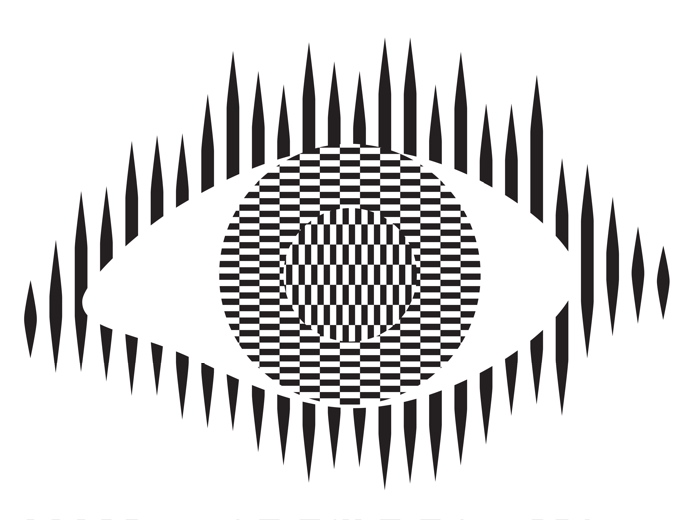
Optical illusions and magic tricks give a mirror on the limits of our brains. Even when you know an optical illusion is an illusion you cannot stop seeing the effect. For example, this image of an eye is completely flat and stationary: nothing is moving. And yet if you move your head very slightly from side to side the centre pops out and seems to be moving separately to the rest of the eye.

Illusions occur because our brains have limited resources and take short cuts in processing the vast amount of information that our senses deliver. These short cuts allow us to understand what we see faster and do so with less resources. Illusions happen when the short cuts are applied in a way where they do not apply.

What this means is that we do not see the world as it really is but see a simplified version constructed by our subconscious brain and provided to our conscious brain. It is very much like in the film, the Matrix, except it is our own brains providing the fake version of the world we experience rather than alien computers.

Attention

The way we focus our attention is one example of this. You may think that you see the world as it is, but you only directly see the things you focus on, your brain fills out the rest rather than constantly feeding the actual information to you constantly. It does this based on what it last saw there but also on the basis of just completing patterns. The following illusion shows this in action. There are 12 black dots and as you move your attention from one to the next you can see and count them all. However, you cannot see them all at once. The ones in your peripheral vision disappear as you look away as the powerful pattern of grey lines takes over. You are not seeing everything that is there to be seen!

Find more on the links to magic in our book

Conjuring with Computation” .

Our brains also have very limited working memory and limited attention. Magicians also exploit this to design “magical systems” where a whole audience make the same mistake at the same time. Design the magic well so that these limitations are triggered and people miss things that are there to be seen, forget things they knew a few moments before, and so on. For example, by distracting their attention they make them miss something that was there to be seen.

What does this mean to computer scientists?

When we design the way we interact with a computer system, whether software and hardware, it is also possible to trigger the same limitations a magician or optical illusion does. A good interaction designer therefore does the opposite to a magician and, for example: draws a user’s attention to things that must not be missed at a critical time; they ensure they do not forget things that are important, they help them keep track of the state of the system, they give good feedback so they know what has happened.

Most software is poorly designed leading to people making mistakes, not all the time, but some of the time. The best designs will help people avoid making mistakes and also help them spot and fix mistakes as soon as they do make them.

Examples of poor medical device design

The following are examples of the interfaces of actual medical devices found in a day of exploration by one researcher (Paolo Masci) at a single very good hospital (in the US).

When the nurse or doctor types the following key sequence as a drug dose rate:

this infusion pump, without any explicit warning, other than the number being displayed, registered the number entered as 1001.

Probably, the programmer had been told that when doses are as large as 100, then fractional doses are so relatively small that they make no difference. A user typing in such fractional amounts, is likely making an error as such a dose is unlikely to be prescribed. The typing of the decimal point is therefore just ignored as a mistake by the infusion pump. Separately, (perhaps coded by a different programmer in the team, or at a different time) until the ENTER key is pressed the code treats the number as incomplete. Any further digits typed are therefore just accepted as part of the number.

This different design by a different manufacturer also treats the key sequence as 1001 (though in the case shown 1001 is rejected as it exceeds the maximum allowable rate, caused by the same issue of the device silently ignoring a decimal point).

This suggests two different coding teams indipendently coded in the same design flaw that led to the same user error.

What is wrong with that?

Devices should never silently ignore and/or correct input if bad mistakes are to be avoided. Here, that original design flaw, could lead to a dose 10x too big being infused into a patient and that could kill. It relies on the person typing the number noticing that the decimal point has been ignored (with no help from the device). Decimal points are small and easily missed of course. Also, their attention cannot be guaranteed to be on the machine and, in fact, with a digit keypad for entering numbers that attnetion is likely to be on the keys. Alarms or other distractions elsewhere could easily mean they do not notice the missing decimal point (which is a tiny thing to see).

An everyday example of the same kind of problem, showing how easily mistakes are missed is in auto-completion / auto-correction of spelling mistakes in texts and word processors. Goofs where an auto-corrected word are missed are very common. Anything that common needs to be designed away in a safety critical system.

Design Rules

One of the ways that such problems can be avoided is by programmers following interaction design rules. The machine (and the programmer writing the code) does not know what a user is trying to input when they make a mistake. One design rule is therefore that a program should therefore NEVER correct any user error silently. Here perhaps the mistake was pressing 0 twice rather than pressing the decimal point. In the case of user errors, the program should raise awareness of the error, and not allow further input until the error is corrected. The program should explicitly draw the person’s attention to the problem (eg changing colour, flashing, beeping, etc). This involves using the same understanding of cognitive psychology as a magician, to control their attention. Whereas a magician would be taking their attention away from the thing that matters, the programmer draws theur attention to it.

It should make clear in an easily understandable error message what the problem is (eg here “Doses over 99 should not include decimal fractions. Please delete the decimal point.”) It should then leave the user to make the correction (eg deleting the decimal point) not do it itself.

By following a design rule such as this programmers can avoid user errors, which are bound to happen, from causing a big problem.

Avoiding errors

Sometimes the way we design software interfaces and their interaction design we can do even better than this, though. We are letting people make mistakes and then telling them to help them pick up the pieces afterward. Sometimes we can do better than this and with better design help them avoid making the mistake in the first place or spot the mistake themselves as soon as they make it.

Doing this is again about controlling user attention as a magician does. An interaction designer needs to do this again in the opposite wayto the magician though, directing the users attention to the place it needs to be to see what is really happening as they take actions rather than away from it.

To use a digit keypad, the users attention has to be on their fingers so they can see where to put their fingers to press a given digit. They look at the keypad, not the screen. The design of the digit keypad draws their attention to the wrong place. However, there are lots of ways to enter numbers and the digit keypad is only one. One other way is to use cursor keys (left, right, up and down) and have a cursor on the screen move to the position where a digit will be changed. Now, once the person’s finger is on say the up arrow, attention naturally moves to the screen as that button is just pressed repeatedly until the correct digit is reached. The user is watching what is happening, watching the program’s output, rather than their input, so is now less likely to make a mistake. If they do overshoot, their attention is in the right place to see it and immediately correct it. Experiments showed that this design did lead to fewer large errors though is slower. With numbers though accuracy is more likely to matter than absolute speed, especially in medical situations.

There are still subtleties to the design though – should a digit roll over from 9 back to 0, for example? If it does should the next digit increase by 1 automatically? Probably not, as these are the things that lead to other errors (out by a factor of 10). Instead going up from 9 should lead to a warning.

Learn from magicians

Magicians are expert at making people make mistakes without them even realising they have. The delight in magic comes from being so easily fooled so that the impossible seems to have happened. When writing software we need to using the same understanding of our cognitive resources and how to manipulate them to prevent our users making mistakes. There are many ways to do this, but we should certainly never write software that silently corrects user errors. We should control the users attention from the outset using similar techniques to a magician so that their attention is in the right place to avoid problems. Ideally a number entry system such as using cursor keys to enter the number rather than a digit keypad should be used as then the attention of the user is more likely to be on the number entered in the first place.

– Paul Curzon, Queen Mary University of London

More on …

Related Careers

Careers related to this article include:

  • Interaction designer
    • Responsible for the design of not just the interface but how a device or software is used. Applying creativity and applying existing design rules to come up with solutions. Has a deep understanding both of technical issues and of the limitations of human cognition (how our brains work).
  • Usability consultant
    • Give advice on making software and gadgets generally easier to use, evaluate designs for features that will make them hard to use or increase the likelihood of errors, finding problems at an early stage.
  • User experience (UX) consultant
    • Give advice on ensuring users of software have a good positive experience and that using it is not for example, frustrating.
  • Medical device developer
    • Develop software or hardware for medical devices used in hospitals or increasingly in the home by patients. Could be improvements to existing devices or completely novel devices based on medical or biomedical breakthroughs, or on computer science breakthroughs, such as in artificial intelligence.
  • Research and Development Scientist
    • Do experiments to learn more about the way our brains work, and/or apply it to give computers and robots a way to see the world like we do. Use it to develop and improve products for a spin-off company.

Magazines …

Our Books …


Subscribe to be notified whenever we publish a new post to the CS4FN blog.


This page is funded by EPSRC on research agreement EP/W033615/1.

QMUL CS4FN EPSRC logos

Much ado about nothing

by Paul Curzon, Queen Mary University of London

A blurred image of a hospital ward
Image by Tyli Jura from Pixabay

The nurse types in a dose of 100.1 mg [milligrams] of a powerful drug and presses start. It duly injects 1001 mg into the patient without telling the nurse that it didn’t do what it was told. You wouldn’t want to be that patient!

Designing a medical device is difficult. It’s not creating the physical machine that causes problems so much as writing the software that controls everything that that machine does. The software is complex and it has to be right. But what do we mean by “right”? The most obvious thing is that when a nurse sets it to do something, that is exactly what it does.

Getting it right is subtler than that though. It must also be easy to use and not mislead the nurse: the human-computer interface has to be right too. It is the software that allows you to interact with a gadget – what buttons you press to get things done and what feedback you are given. There are some basic principles to follow when designing interfaces. One is that the person using it should always be clearly told what it is doing.

Manufacturers need ways to check their devices meet these principles: to know that they got it right.

It’s not just the manufacturers, though. Regulators have the job of checking that machines that might harm people are ‘right’ before they allow them to be sold. That’s really difficult given the software could be millions of lines long. Worse they only have a short time to give an answer.

Million to one chances are guaranteed to happen.

Problems may only happen once in a million times a device is used. They are virtually impossible to find by having someone try possibilities to see what happens, the traditional way software is checked. Of course, if a million devices are bought, then a million to one chance will happen to someone, somewhere almost immediately!

Paolo Masci at Queen Mary University of London, has come up with a way to help and in doing so found a curious problem. He’s been working with the US regulator for medical devices – the FDA – and developed a way to use maths to find problems. It involves creating a mathematical description of what critical parts of the interface program do. Properties, like the user always knowing what is going on, can then be checked using maths. Paolo tried it out on the code for entering numbers of a real medical device and found some subtle problems. He showed that if you typed in certain numbers, the machine actually treated them as a number ten times bigger. Type in a dose of 100.1 and the machine really did set the dose to be 1001. It ignored the decimal point because on such a large dose it assumed small fractions are irrelevant. However another part of the code allows you to continue typing digits. Worse still the device ignores that decimal point silently. It doesn’t make any attempt to help a nurse notice the change. A busy nurse would need to be extremely vigilant to see the tiny decimal point was missing given the lack of warning.

A useful thing about Paolo’s approach is that it gives you the button presses that lead to the problem. With that you can check other devices very quickly. He found that medical devices from three other manufacturers had exactly the same problem. Different teams had all programmed in the same problem. None had thought that if their code ignored a decimal point, it ought to warn the nurse about it rather than create a number ten times bigger. It turns out that different programmers are likely to think the same way and so make the same mistakes (see ‘Double or Nothing‘).

Now the problem is known, nurses can be warned to be extra careful and the manufacturers can update the software. Better still they and the regulators now have an easy way to check their programmers haven’t made the same mistake in future devices. In future, whether vigilant or not, a nurse won’t be able to get it wrong.


Further reading

This article was first published on the CS4FN website (archived copy) and there is a copy on page 8 of issue 17 of the CS4FN magazine which you can download below.


Related Magazine …


Subscribe to be notified whenever we publish a new post to the CS4FN blog.


This page is funded by EPSRC on research agreement EP/W033615/1.

QMUL CS4FN EPSRC logos

Pit-stop heart surgery

by Paul Curzon, Queen Mary University of London

(Updated from the archive)

Image by Peter Fischer from Pixabay

The Formula 1 car screams to a stop in the pit-lane. Seven seconds later, it has roared away again, back into the race. In those few seconds it has been refuelled and all four wheels changed. Formula 1 pit-stops are the ultimate in high-tech team work. Now the Ferrari pit stop team have helped improve the hospital care of children after open-heart surgery!

Open-heart surgery is obviously a complicated business. It involves a big team of people working with a lot of technology to do a complicated operation. Both during and after the operation the patient is kept alive by computer: lots of computers, in fact. A ventilator is breathing for them, other computers are pumping drugs through their veins and yet more are monitoring them so the doctors know how their body is coping. Designing how this is done is not just about designing the machines and what they do. It is also about designing what the people do – how the system as a whole works is critical.

Pass it on

One of the critical times in open-heart surgery is actually after it is all over. The patient has to be moved from the operating theatre to the intensive care unit where a ‘handover’ happens. All the machines they were connected to have to be removed, moved with them or swapped for those in the intensive care unit. Not only that, a lot of information has to be passed from the operating team to the care team. The team taking over need to know the important details of what happened and especially any problems, if they are to give the best care possible.

A research team from the University of Oxford and Great Ormond Street Hospital in London wondered if hospital teams could learn anything from the way other critical teams work. This is an important part of computational thinking – the way computer scientists solve problems. Rather than starting from scratch, find a similar problem that has already been solved and adapt its solution for the new situation.

Rather than starting from scratch,
find a similar problem
that has already been solved

Just as the pit-stop team are under intense time pressure, the operating theatre team are under pressure to be back in the operating theatre for the next operation as soon as possible. In a handover from surgery there is lots of scope for small mistakes to be made that slow things down or cause problems that need to be fixed. In situations like this, it’s not just the technology that matters but the way everyone works together around it. The system as a whole needs to be well designed and pit stop teams are clearly in the lead.

Smooth moves

To find out more, the research team watched the Ferrari F1 team practice pit-stops as well as talking to the race director about how they worked. They then talked to operating theatre and intensive care unit teams to see how the ideas might work in a hospital handover. They came up with lots of changes to the way the hospital did the handover.

For example, in a pit-stop there is one person coordinating everything – the person with the ‘lollipop’ sign that reminds the driver to keep their brakes on. In the hospital handover there was no person with that job. In the new version the anaesthetist was given the overall job for coordinating the team. Once the handover was completed that responsibility was formally passed to the intensive care unit doctor. In Formula 1 each person has only one or two clear tasks to do. In the hospital people’s roles were less obvious. So each person was given a clear responsibility: the nurses were made responsible for issues with draining fluids from the patient, anaesthetist for ventilation issues, and so on. In Formula 1 checklists are used to avoid people missing steps. Nothing like that was used in the handover so a checklist was created, to be used by the team taking on the patient.

These and other changes led to what the researchers hoped would be a much improved way of doing handovers. But was it better?

Calm efficiency saves the day

To find out they studied 50 handovers – roughly half before the change was made and half after. That way they had a direct way of seeing the difference. They used a checklist of common problems noting both mistakes made and steps that proved unusually difficult. They also noted how well the teams worked together: whether they were calm and supported each other, planned what they did, whether equipment was available when needed, and so on.

They found that the changes led to clearly better handovers. Fewer errors were made both with the technology and in passing on information. Better still, while the best performance still happened when the teams worked well, the changes meant that teamwork problems became less critical. Pit-stops and open-heart surgery may be a world apart, with one being about getting every last millisecond of speed and the other about giving as good care as possible. But if you want to improve how well technology and people work together, you need to think about more than just the gadgets. It is worth looking for solutions anywhere: children can be helped to recover from heart surgery even by the high-octane glitz of Formula 1.

More on …

Magazines …


EPSRC supports this blog through research grant EP/W033615/1. 

Nurses in the mist

by Paul Curzon, Queen Mary University of London

(From the archive)

A gorilla hugging a baby gorilla
Image by Angela from Pixabay

What do you do when your boss tells you “go and invent a new product”? Lock yourself away and stare out the window? Go for a walk, waiting for inspiration? Medical device system engineers Pat Baird and Katie Hansbro did some anthropology.

Dian Fossey is perhaps the most famous anthropologist. She spent over a decade living in the jungle with gorillas so that she could understand them in a way no one had done before. She started to see what it was really like to be a gorilla, showing that their fierce King Kong image was wrong and that they are actually gentle giants: social animals with individual personalities and strong family ties. Her book and film, ‘Gorillas in the Mist’, tells the story.

Pat and Katie work for Baxter Healthcare. They are responsible for developing medical devices like the infusion pumps hospitals use to pump drugs into people to keep them alive or reduce their pain. Hospitals don’t buy medical devices like we buy phones, of course. They aren’t bought just because they have lots of sexy new features. Hospitals buy new medical devices if they solve real problems. They want solutions that save lives, or save money, and if possible both! To invent something new that sells you ideally need to solve problems your competitors aren’t even aware of. Challenged to come up with something new, Pat and Katie wondered if, given the equivalent was so productive for Dian Fossey, perhaps immersing themselves in hospitals with nurses would give the advantage their company was after. Their idea was that understanding what it was really like to be a nurse would make a big difference to their ability to design medical devices. That helped with the real problems nurses had rather than those that the sales people said were problems. After all the sales people only talk to the managers, and the managers don’t work on the wards. They were right.

Taking notes

They took a team on a 3-month hospital tour, talking to people, watching them do their jobs and keeping notes of everything. They noted things like the layout of rooms and how big they were, recorded the temperature, how noisy it was, how many flashing lights and so on. They spent a lot of time in the critical care wards where infusion pumps were used the most but they also went to lots of other wards and found the pumps being used in other ways. They didn’t just talk to nurses either. Patients are moved around to have scans or change wards, so they followed them, talking to the porters doing the pushing. They observed the rooms where the devices were cleaned and stored. They looked for places where people were doing ad hoc things like sticking post it note reminders on machines. That might be an opportunity for them to help. They looked at the machines around the pumps. That told them about opportunities for making the devices fit into the bigger tasks the nurses were using them as part of.

The hot Texan summer was a problem

So did Katie and Pat come up with a new product as their boss wanted? Yes. They developed a whole new service that is bringing in the money, but they did much more too. They showed that anthropology brings lots of advantages for medical device companies. One part of Pat’s job, for example, is to troubleshoot when his customers are having problems. He found after the study that, because he understood so much more about how pumps were used, he could diagnose problems more easily. That saved time and money for everyone. For example, touch screen pumps were being damaged. It was because when they were stored together on a shelf their clips were scratching the ones behind. They had also seen patients sitting outside in the ambulance bays with their pumps for long periods smoking. Not their problem, apart from it was Texas and the temperature outside was higher than the safe operating limit of the electronics. Hospitals don’t get that hot so no one imagined there might be a problem. Now they knew.

Porters shouldn’t be missed

Pat and Katie also showed that to design a really good product you had to design for people you might not even think about, never mind talk to. By watching the porters they saw there was a problem when a patient was on lots of drugs each with its own pump. The porter pushing the bed also had to pull along a gaggle of pumps. How do you do that? Drag them behind by the tubes? Maybe the manufacturers can design in a way to make it easy. No one had ever bothered talking to the porters before. After all they are the low paid people, doing the grunt jobs, expected to be invisible. Except they are important and their problems matter to patient safety. The advantages didn’t stop there, either. Because of all that measuring, the company had the raw data to create models of lots of different ward environments that all the team could use when designing. It meant they could explore in a virtual environment how well introducing new technology might fix problems (or even see what problems it would cause).

All in all anthropology was a big success. It turns out observing the detail matters. It gives a commercial advantage, and all that mundane knowledge of what really goes on allowed the designers to redesign their pumps to fix potential problems. That makes the machines more reliable, and saves money on repairs. It’s better for everyone.

Talking to porters, observing cupboards, watching ambulance bays: sometimes it’s the mundane things that make the difference. To be a great systems designer you have to deeply understand all the people and situations you are designing for, not just the power users and the normal situations. If you want to innovate, like Pat and Katie, take a leaf out of Dian Fossey’s book. Try anthropology.

More on …

Magazines …


EPSRC supports this blog through research grant EP/W033615/1. 

Microwave Racing

Making everyday devices easier to use

An image of a microwave (cartoon), all in grey with dials and a button.
Microwave image by Paul from Pixabay

When you go shopping for a new gadget like a smartphone or perhaps a microwave are you mostly wowed by its sleek looks, do you drool over its long list of extra functionality? Do you then not use those extra functions because you don’t know how? Rather than just drooling, why not go to the races to help find a device you will actually use, because it is easy to use!

On your marks, get set… microwave

Take an everyday gadget like a microwave. They have been around a while, so manufacturers have had a long time to improve their designs and so make them easy to use. You wouldn’t expect there to be problems would you! There are lots of ways a gadget can be harder to use than necessary – more button presses maybe, lots of menus to get lost in, more special key sequences to forget, easy opportunities to make mistakes, no obvious feedback to tell you what it’s doing… Just trying to do simple things with each alternative is one way to check out how easy they are to use. How simple is it to cook some peas with your microwave? Could it be even simpler? Dom Furniss, a researcher at UCL decided to video some microwave racing as a fun way to find out…

Everyday devices still cause people problems even when they are trying to do really simple things. What is clear from Microwave racing is that some really are easier to use than others. Does it matter? Perhaps not if it’s just an odd minute wasted here or there cooking dinner or if actually, despite your drooling in the shop, you don’t really care that you never use any of those ‘advanced’ features because you can never remember how to.

Better design helps avoid mistakes

Would it matter to you more though if the device in question was a medical device that keeps a patient alive, but where a mistake could kill? There are lots of such gadgets: infusion pumps for example. They are the machines you are hook up to in a hospital via tubes. They pump life-saving drugs, nutrient rich solutions or extra fluids to keep you hydrated directly into your body. If the nurse makes a mistake setting the rate or volume then it could make you worse rather than better. Surely then you want the device to help the nurse to get it right.

Making safer medical devices is what the research project, called CHI+MED, that Dom works* on is actually about. While the consequences are completely different, the core task in setting an infusion pump is actually very similar to setting a microwave – “set a number for the volume of drug and another for the rate to infuse it and hit start” versus “set a number for the power and another for the cooking time, then hit start”. The same types of design solutions (both good and bad) crop up in both cases. Nurses have to set such gadgets day in day out. In an intensive care unit, they will be using several at a time with each patient. Do you really want to waste lots of minutes of such a nurse’s time day in, day out? Do you want a nurse to easily be able to make mistakes in doing so?

User feedback

What the microwave racing video shows is that the designers of gadgets can make them trivially simple to use. They can also make them very hard to use if they focus more on the looks and functions of the thing than ease of use. Manufacturers of devices are only likely to take ease of use seriously if the people doing the buying make it clear that we care. Mostly we give the impression that we want features so that is what we get. Microwave racing may not be the best way to do it (follow the links below to explore more about actual ways professionals evaluate devices), but next time you are out looking for a new gadget check how easy it is to use before you buy … especially if the gadget is an infusion pump and you happen to be the person placing orders for a hospital!

– Dom Furniss and Paul Curzon, 2015

*The CHI+MED project ended in 2015 and this issue of CS4FN was one of the project’s outputs.

Magazines …

The original version of this article was originally published on the CS4FN website and on page 16 of Issue 17 of CS4FN, “Machines making medicine safer“, which is free to download as a PDF, along with all of our other free material, here: https://cs4fndownloads.wordpress.com/

Subscribe to be notified whenever we publish a new post to the CS4FN blog.


This page is funded by EPSRC on research agreement EP/W033615/1.

QMUL CS4FN EPSRC logos