First of all, artists have been investigating light, colour, perception and illusions and the way our brains process this far longer than science as such has even existed, never mind used to study those phenomena. They built a massive foundation of knowledge upon which our current visual technology relies from the pixel grids of screens to the way we construct 3D computer generated imagery, and virtual reality worlds. Much of our modern technology is based on the knowledge created by artists, not just scientists and engineers. And Joseph Wright was a master of the use of light (and dark).
He is particularly famous for his paintings of candlelit scenes full of highlighted faces emerging from shadows as featured in the National Gallery exhibition. This use of extreme light and dark to conjure a feeling of drama didn’t start with him, though. It was pioneered and perfected by painters like Caravaggio and Rembrandt who were his inspiration. However, they used the technique in paintings depicting scenes from history, the Bible and ancient mythology. He grew up in the middle of the Industrial Revolution with Derbyshire being the source of the industrial Revolution with the first cotton factories powered by water built in the area around Matlock and the first water-powered silk mill built in Derby itself. Wright painted both the first Cotton Mill at Cromford and the pioneer of the industrial revolution responsible, Sir Richard Arkwright. Immersed in the spirit of the age he was the first professional painter to paint in this dramatic style of light and dark scenes of science and engineering.
His paintings were essentially works of public engagement with science and technology. In this he is one of the first to take public engagement for the masses seriously. He died in 1797, 2 years before the Royal Institution was founded, now famous for its Christmas Lectures which pioneered science demonstrations for all. They were initiated by Faraday in 1825. Wright didn’t just paint these scenes of technology and of people watching science demonstrations. After all a painting would only be seen by a small number of people. and possibly only the family and friends of the person who commissioned it. Wright also took his work to the masses by commissioning mezzotints of his paintings. These were high quality black and white prints that could be relatively cheaply mass-produced so widely disseminated. Mezzotints were even portrayed back lit in shop windows so that anyone could see them from the street.
It is more important as ever that Scientists engage with the public about their work, and artists still provide one way to do so. So what would Joseph Wright be painting now in the current computer and AI revolution? Children wearing virtual reality goggles, arms out touching non-existent things, with astounded expressions perhaps? A group gathered round a robotic arm picking up an egg? All lit of course by the screens of smartphones.
Image by Paul Curzon taken at Tate Modern London at Olafur Eliasson’s “The cubic structural evolution project” exhibition, 2019.
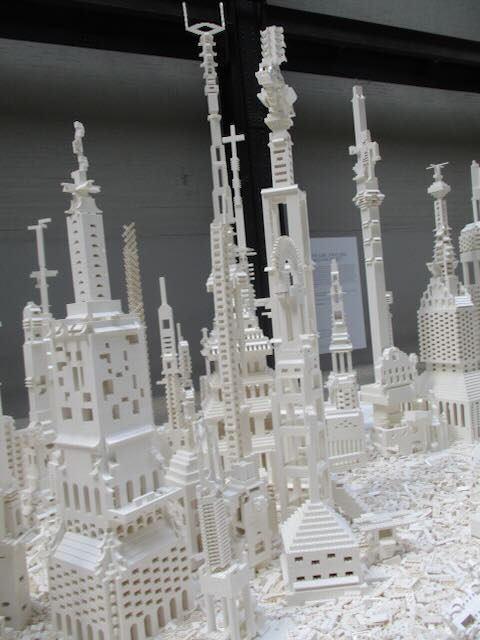
My absolute favourite example of interactive art is Olafur Eliasson‘s “The cubic structural evolution project” back in 2019 at Tate Modern. It was “just” two piles of standard white Lego bricks piled on two tables (but a tonne of Lego between the two …so a LOT of Lego). Anyone visiting the exhibit was invited to sit down and help create a city by building a building … and it was joyfully creative. Kids and adults mixed together building great architectural wonders, big and small, out of the bricks. Sometimes intentionally, but often accidentally, an existing building was demolished, but that was just an opportunity for new amazing buildings to emerge from the rubble. We visited twice that summer, and each time a totally different city was there that had emerged from this constant evolution of building. On each visit we built something new ourselves to add to the ever changing city.
The exhibit took Lego back to its roots – no instructions, no specific creation to reproduce, just the bare building blocks of creativity. You can still buy generic lego sets of course (if not with the same scope as a tonne of bricks). However, the high profile modern Lego sets are now used to build a specific thing designed by someone else, like a Star Wars Tie fighter, a Death Star, a Ferrari, a parrot or perhaps Notre Dame. This is one form of creativity – you are definitely creating something, and doing so gives you an amazing feeling of accomplishment and well-being. I strongly recommend it and of doing similar activities whether doing a tapestry, or building a jigsaw, or … It is good for your happiness and mental health more generally. But you are creating just by following instructions. In computer science terms, you are acting as a computational agent, following an algorithm that if followed precisely guarantees the same result every time (an exact copy of the lighthouse on the box perhaps…). A computer (with a suitably good robotic arm and vision system) could do it. That is the point of algorithms! They take no thought just an ability to follow instructions precisely: the thing computers are good at.
There is another sense we mean when we talk about creativity though and that was the original Lego idea. You have the bricks. You can build anything. It is down to you. Create something new! According to an exhibition on the history of play I went to early construction kits like the original Lego inspired a whole generation of architects to do completely new things with buildings (if you know your architecture think especially Frank Lloyd Wright whose mother bought him educational blocks called the Froebel Gifts, or perhaps Denys Lasdun – I lived in one of his “Lasdun building” block like buildings for a year in my younger days).
This kind of pure creativity is what being a programmer is about. Not just following instructions to create someone else’s creation, but creating your own totally novel, wondrous things from simple building blocks (and you don’t have to be part of the Lego design team to do it either). That is the lesson that collaboratively emerged in Olafur Eliasson’s exhibit over and over again. Just as the inventor of Lego, Ole Kirk Christiansen, in creating the toy went to yet another level of creativity in doing so, Olafur Eliasson did so to in creating the exhibition. They both created the opportunities for others to be creative.
Programming languages are very much like Lego in this sense. They just provide the building blocks to create any program you want. Learn how to use them and you you can do anything if you have the imagination as well as having built the skill. The different constructs are like different kinds of Lego bricks. Put them together in different ways and you create different things. You can stick with the basics and still build amazing creations even without learning about all the libraries methods that act like specialist bricks designed for specialist purposes. And of course the early Computer Scientists who invented the idea of programming languages were being creative in the way Ole Kirk Christiansen and Olafur Eliasson were, creating the possibility for others. Creating possibilities for you.
The Arts are about pure creativity but so is Computer Science…(and when they are brought together by creative people even more amazing things can be created (by everyone).
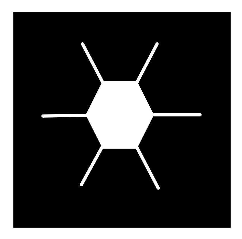
Following algorithms to draw nature can lead to natural looking pictures of all all sorts of things: from trees to snowflakes. It is one way computer generated imagery (CGI) scenery is created for films and games. You can write computer programs to do it if you have programming skill, but it can be just as fun (and more stress-relieving) to just doodle algorithmic pictures by hand – you act as what computer scientists call a ‘computational agent’ just following the algorithm. Here is an example Doodle Algorithm to draw a snowflake.
The DoodleDraw Algorithm
1. Draw a Black rectangle
2. Draw a SnowflakeHex in the middle of the black rectangle.
3. DoodleDraw a.Hexagon Snowflake

To Draw a SnowflakeHex:
    1. Draw a white hexagon with white lines sticking out from each corner (as shown).

To DoodleDraw a Hexagon Snowflake:
    1. IF happy with the picture THEN STOP
        ELSE
            1. Pick an existing SnowflakeHex and pick a line on it.
            2. Draw a new smaller SnowflakeHex on that line.
            3. DoodleDraw a Hexagon Snowflake.
Image by CS4FN
The doodle this led to for me is given below… does it look snowflake-ish? Now follow the algorithm and draw your own, just like snowflakes every drawing should be different even if following the same algorithm as we include random steps in the algorithm.
Image by CS4FN
Different algorithms with different starting shapes give different looking trees, grasses, ferns, snowflakes, crystals,… Often nature is following a very similar recursive creation process, which is why the results can be realistic.
Try inventing your own doodle art algorithm and see how realistic the drawings you end up with are. First try using a slightly different starting picture to ours above (eg a hollow hexagon instead of a filled in one, or skip the lines, or have more lines, or have a different central image to the one that is then replicated…and see what you end up with. Find lots more ideas for doodle draw algorithms on our DoodleDraw page.
Next time you find yourself doodling in a meeting or lecture, invent your own doodle draw algorithm, draw an algorithmic doodle, develop your algorithmic thinking skills and at the same time explore algorithms for drawing nature.
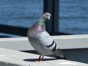
On April Fool’s Day in 2002 Google ‘admitted’ to its users that the reason their web search results appeared so quickly and were so accurate was because, rather than using automated processes to grab the best result, Google was actually using a bank of pigeons to select the best results. Millions of pigeons viewing web pages and pecking picking the best one for you when you type in your search question. Pretty unlikely, right?
In a rather surprising non-April Fool twist some researchers decided to test out how well pigeons can distinguish different types of information in hospital photographs.
Letting the pigeons learn from training data They trained pigeons by getting them to view medical pictures of tissue samples taken from healthy people as well as pictures taken from people who were ill. The pigeons had to peck one of two coloured buttons and in doing so learned which pictures were of healthy tissue and which were diseased. If they pecked the correct button they got an extra food reward.
Seeing if their new knowledge is ‘generalisable’ (can be applied to unfamiliar images) The researchers then tested the pigeons with a fresh set of pictures, to see if they could apply their learning to pictures they’d not seen before. Incredibly the pigeons were pretty good at separating the pictures into healthy and unhealthy, with an 80 per cent hit rate. Doctors and pathologists* probably don’t have to worry too much about pigeons stealing their jobs though as the pigeons weren’t very good at the more complex cases. However this is still useful information. Researchers think that they might be able to learn something, about how humans learn to distinguish images, by understanding the ways in which pigeons’ brains and memory works (or don’t work). There are some similarities between pigeons’ and people’s visual systems (the ways our eyes and brains help us understand an image).
[*pathology means the study of diseases. A pathologist is a medical doctor or clinical scientist who might examine tissue samples (or images of tissue samples) to help doctors diagnose and treat diseases.]
How well can you categorise?
This is similar to a way that some artificial intelligences work. A type of machine learning called supervised learning gives an artificial intelligence system a batch of photographs labelled ‘A’, e.g. cats, and a different batch of photographs labelled ‘B’, e.g. dogs. The system makes lots of measurements of all the pictures within the two categories and can use this information to decide if a new picture is ‘CAT’ or ‘DOG’ and also how confident it is in saying which one.
Can pigeons tell art apart?
Pigeons were also given a button to peck and shown artworks by Picasso or Monet. At first they’d peck the button randomly but soon learned that they’d get a treat if they pecked at the same time they were shown a Picasso. When a Monet appeared they got no treat. After a while they learned to peck when they saw the Picasso artworks and not peck when shown a Monet. But what happened if they were shown a Monet or Picasso painting that they hadn’t seen before? Amazingly they were pretty good, pecking for rewards when the new art was by Picasso and ignoring the button when it was a new Monet. Art critics can breathe a sigh of relief though. If the paintings were turned upside down the pigeons were back to square one and couldn’t tell them apart.
Aaron is a successful American painter. Aaron’s delicate and colourful compositions on canvas sell well in the American art market, and have been exhibited worldwide, in London’s Tate Modern gallery and the San Francisco Museum of Modern Art for example. Oh and by the way, Aaron is a robot!
Yes, Aaron is a robot, controlled by artificial intelligence, and part of a lifelong experiment undertaken by the late Harold Cohen to create a creative machine. Aaron never paints the same picture twice; it doesn’t simply recall pictures from some big database. Instead Aaron has been programmed to work autonomously. That is, once it starts there is no further human intervention, Aaron just draws and paints following the rules for art that it has been taught.
Perfecting the art of painting
Aaron’s computer program has grown and developed over the years, and like other famous painters, has passed though a number of artistic periods. Back in the early 1970s all Aaron could do was draw simple shapes, albeit shapes that looked hand drawn – not the sorts of precise geometric shapes that normal computer graphics produced. No, Aaron was going to be a creative artist. In the late 1970s Aaron learned something about artistic perspective, namely that objects in the foreground are larger than objects in a picture’s background. In the late 80s Aaron could start to draw human figures, knowing how the various shapes of the human body were joined together, and then learning how to change these shapes as a body moved in three dimensions. Now Aaron knows how to add colour to its drawings, to get those clever compositions of shades just spot on and to produce bold, unique pictures, painted with brush on canvas by its robotic arm.
It’s what you know that counts
When creating a new painting Aaron draws on two types of knowledge. First Aaron knows about things in the real world: the shapes that make up the human body, or a simple tree. This so called declarative (declared) knowledge is encoded in rules in Aaron’s programming. It’s a little like human memory: you know something about how the different shapes in the world work. This information is stored somewhere in your brain. The second type of knowledge Aaron uses is called procedural knowledge. Procedural knowledge allows you to move (process) from a start to an end through a chain of connected steps. Aaron, for example, knows how to proceed through painting areas of a scene to get the colour balance correct and in particular, getting the tone or brightness of the colour right. That is often more artistically important than the actual colours themselves. Inside Aaron’s computer program these two types of knowledge, declarative and procedural, are continuously interacting with each other in complex ways. Perhaps this blending of the two types of knowledge is the root of artistic creativity?
Creating Creativity
Though a successful artist, and capable of producing pleasing and creative pictures, Aaron’s computer program still has many limitations. Though the pictures look impressive, that’s not enough. To really understand creativity we need to examine the process by which they have been made. We have an ‘artist’ that we can take to pieces and examine in detail. Studying what Aaron can do, given we know exactly what’s been programmed into it, allows us to examine human creativity. What about it is different from the way humans paint, for example? What would we need to add to Aaron to make its process of painting more similar to human creativity?
Not quite human
Unlike a human artist Aaron cannot go back and correct what it does. Studies of great artist’s paintings often show that under the top layer of paint there are many other parts of the picture that have been painted out, or initial sketches that have been redrawn as the artist progresses through the work, perfecting it as they go. Aaron always starts in the foreground of the picture and moves toward painting the background later, whereas human artists can chop and change which part of a picture to work on to get it just right. Perhaps in the future, with human help Aaron or robots like him will develop new human-like painting skills and produce even better paintings. Until then the art world will need to content itself with Aaron’s early period work.
– the CS4FN team (updated from the archive)
Some of Aaron’s (and Harold COhen’s) work is on display at the Tate modern until June 2025 as part of the Electric Dreams exhibition.
Piet Mondrian is famous for his pioneering pure abstract paintings that consist of blocks of colour with thick black borders. This series of works is iconic now. You can buy designs based on them on socks, cards, bags, T-shorts, vases, and more, He also inspired one of the first creative art programs. Written by Hiroshi Kawano it created new abstract art after Mondrian.
Image by CS4FN after Mondrian inspired by Artificial Mondrian
Hiroshi Kawano was himself a pioneer of digital and algorithmic art. From 1964 he produced a series of works that were algorithmically created in that they followed instructions to produce the designs, but those designs were all different as they included random number generators – effectively turning art into a game of chance, throwing dice to see what to do next. Randomness can be brought in in this way to make decisions about the sizes, positions, shapes and colours in the images, for example.
His Artificial Mondrian series from the late 1960s were more sophisticated than this though. He first analysed Mondrian’s paintings determining how frequently each colour appeared in each position on the canvas. This gave him a statistical profile of real Mondrian works. His Artificial Mondrian program then generated new designs based on coloured rectangles but where the random number generator matched the statistical pattern of Mondrian’s creative decisions when choosing what block of colour to paint in an area. The dice were in effect loaded to match Mondrian’s choices. The resulting design was not a Mondrian, but had the same mathematical signature as one that Mondrian might paint. One example KD 29 is on display at the Tate modern this year (2025) until June 2025 as part of the Electric Dreams exhibition (you can also buy a print from the Tate Modern Shop).
Kawano’s program didn’t actually paint, it just created the designs and then Hiroshidid the actual painting following the program’s design. Colour computer printers were not available then but the program could print out the patterns of black rectangles that he then coloured in.
Whilst far simpler, his program’s approach prefigures the way modern generative AI programs that create images work. They are trained on vast numbers of images, from the web, for example. They then create a new image based on what is statistically likely to match the prompt given. Ask for a cat and you get an image that statistically matches existing images labelled as cats. Like his the generative AI programs are also combining algorithm, statistics from existing art, and randomness to create new images.
Is such algorithmic art really creative in the way an artist is creative though? It is quite easy (and fun) to create your own Mondrian inspired art, even without an AI. However, the real creativity of an artist is in coming up with such a new iconic and visually powerful art style in the first place, as Piet Mondrian did, not in just copying his style. The most famous artists are famous because they came up with a signature style. Only when the programs are doing that are they being as creative as the great human artists. Hiroshi Kawano’s art (as opposed to his program’s) perhaps does pass the test as he came up with a completely novel medium for creating art. That in itself was incredibly creative at the time.
Piet Mondrian was a pioneer of abstract art. He was a Dutch painter, famous for his minimalist abstract art. His series of grid-based paintings consisted of rectangles, some of solid primary colour, others white, separated by thick black lines. Experiment with Mondrian-inspired art like this one of mine, while also exploring different representations of images (as well as playing with maths). Mondrian‘s art is also a way to to learn to program in the image representation language SVG.
We will use this image to give you the idea, but you could use your own images using different image representations, then get others to treat them as puzzles to recreate the originals.
Vector Images
One way to represent an image in a computer is as a vector image. One way to think of what a vector representation is, is that the image is represented as a series of mathematically precise shapes. Another way to think of it is that the image is represented by a program that if followed recreates it. We will use a simple (invented) language for humans to follow to give the idea. In this language a program is a sequence of instructions to be followed in the order given. Each instruction gives a shape to draw. For example,
Rectangle(Red, 3, 6, 2, 4)
Image by CS4FN
means draw a red rectangle position 3 along and 6 down of size 2 by 4 cm.
Rectangle is the particular instruction giving the shape. The values in the brackets (Red, 3, 6, 2, 4) are arguments. They tell you the colour to fill the shape in, its position as two numbers and its size (two further numbers). The numbers refer to what is called a bounding box – an invisible box that surrounds the shape. You draw the biggest shape that fits in the box. All measurements are in cm. With rectangles the bounding box is exactly the rectangle.
In my language, the position numbers tell you where the top left corner of the bounding box is. The first number is the distance to go along the top of the page from the top left corner. The second number is the distance to go down from that point. The top left corner of the bounding box in the above instruction is 3cm along the page and 6cm down.
The final two numbers give the size of the bounding box. The first number is its width. The second number is its height. For a rectangle, if the two numbers are the same it means draw a square. If they are different it will be a rectangle (a squashed square!)
Here is a program representation of my Mondrian-inspired picture above (in my invented langigae).
Create your own copy of my picture by following these instructions on squared paper. Then create your own picture and write instructions of it for others to follow to recreate it exactly.
Mondrian in SVG
My pseudocode language above was for people to follow to create drawings on paper, but it is very close to a real industrial standard graphics drawing language called SVG. If you prefer to paint on a computer rather than paper, you can do it by writing SVG programs in a Text Editor and then viewing them in a web browser.
In SVG an instruction to draw a rectangle like my first black one in the full instructions above is just written
The instruction starts < and end />. “rect” says you want to draw a rectangle (other commands draw other shapes) and each of the arguments are given with a label saying what they mean, so x=”0″ means this rectangle has x coordinate at 0. A program to draw a Mondrian inspired picture is just a sequence of commands like this. However you need a command at the start to say this is an SVG program and give the size/position of the frame (or viewBox) the picture is in. My Mondrian-inspired picture is 16×16 so my picture has to start:
Cut and paste this program into a Text editor*. Save it with name mondrian.svg and then just open it in a browser. See below for more on text editors and browsers. The text editor sees the file as just text so shows you the program. A browser sees the file as a program which it executes so shows you the picture.
Now edit the program to explore, save it and open it again.
Try changing some of the colours and see what happens.
Change the coordinates
Once you have the idea create your own picture made of rectangles.
Shrinking and enlarging pictures
One of the advantages of vector graphics is that you can enlarge them (or shrink them) without losing any of the mathematical precision. Make your browser window bigger and your picture will get bigger but otherwise be the same. Doing a transformations like enlargement on the images is just a matter of multiplying all the numbers in the program by some scaling factor. You may have done transformations like this at School in Maths and wondered what the point was. No you know one massively important use. It is the basis of a really flexible way to create and store images. Of course images do not have to be flat, they can be 3-dimensional and the same maths allow you to manipulate 3D computer images ie CGI (computer generated imagery) in films and games.
On a Windows computer you can find notepad.exe using either the search option in the task bar (or Windows+R and start typing notepad…). On a Mac use Spotlight Search (Command+spacebar) to search for TextEdit. Save your file as an SVG using the .svg (not .txt) as the ending and then open it in a browser (on a Mac you can grab the title of the open file and drag and drop it into a web page where it will open as the drawn image).
Wearable computing is now increasingly common whether wearing smart watches or clothes that light up. The pioneer of the latter was Japanese artist, Tanaka Atsuko, with her 1950s art work, Electric Dress. It was anything but light though, weighing 50-60kg, clothing her head to foot in a mixture of fluorescent and normal light bulbs.
She was a member of the influential Gutai (meaning concrete as opposed to abstract) Art Association and Zero Society of Japanese artists who pioneered highly experimental performance and conceptual art, that often included the artist’s actual body. The Electric Dress was an example of this, and she experimented with combining art and electronics in other work too.
Atsuko had studied dress-making as well as art, and did dress making as a hobby, so fashion was perhaps a likely way for her to express her artistic ideas, but Electric Dress was much more than just fashion as a medium for art. She had the idea of the dress when surrounded by the fluorescent lights in Osaka city centre. She set about designing and making the dress and ultimately walked around the gallery wearing it when it was exhibited at the 2nd Gutai Art Exhibition in Tokyo. Once on it flashed the lights randomly, bathing her in multicoloured light. Wearing it was potentially dangerous. It was incredibly hot and the light was dazzling. There was also a risk of electrocution if anything went wrong! She is quoted as saying after wearing it: “I had the fleeting thought: Is this how a death-row inmate would feel?”
It wasn’t the first time, electric lights had been worn, since as early as 1884 you could hire women, wearing lights on their heads powered by batteries hidden in their clothes, to light up a cocktail party, for example. However, Tanaka Atsuko’s was certainly the most extreme and influential version of a light dress, and shows how art and artists can inspire new ideas in technology. Up to then, what constituted wearable computing was more about watch like gadgets than adding electronics or computing to clothes.
Now, of course, with LEDs, and conductive thread that can be sewn into clothes and special micro-controllers, an electric dress is both much easier to make, and with programming skill you can program the lights in all sorts of creative ways. One example is a dress created for a BBC educational special of Strictly Come Dancing promoting the BBC micro:bit and showing what it was capable of with creativity. Worn by professional dancer, Karen Hauer, in a special dance to show it off, the micro:bit’s accelerometer was used to control the way the LEDs covering the dress in place of sequins, lit up in patterns. The faster she spun while dancing the more furious the patterns of the lights flashing.
Now you can easily buy kits to create your own computer-controlled clothes with online guides to get you started, so if interested in fashion and computer science why not start experimenting. Unlike Tanaka Atsuko you won’t have to put your life at risk for your art and wearable computing, overlapping with soft robotics is now a major research area, so it could be the start of a great research career.
Electric Dreams covers artists use of machines to create art over the second half of the 20th century, covering a wide range of styles and ideas often involving light and motion in thought-provoking ways. The exhibition ranges from the early wearable art of Atsuko Tanaka – a 1956 Electric Dress that coated the wearer in lights (before the age of LEDs so it was a weighty 60 kg) through the first computer choreography of dance; Hirosho Karano’s program that painted like Mondrian; the Art of Harold Cohen’s program Aaron, the first AI artist creating physical art, to Rebecca Allen’s early use of motion capture in art from 1982 and beyond.
While there you should visit Anthony McCall’s Solid Light exhibition. Using just 35 mm film projected in dark smoky rooms he creates an amazing immersive experience that is fun for toddlers and adults alike. It consists of changing sculptures made of slowly moving, curved walls of light that the viewer walks, around, in and through. Sit and watch or interact yourself and become part of the art. It is playful, awe-inspiring and thought-provoking all at once. Exactly what I think the best art should be.
If you want a first experience of an art gallery for a three-year old then you would struggle to do better than a visit to the Tate Modern. Start with Solid Light, followed by visiting the room in Electric Dreams containing Carlos Cruz-Diez’s work where you play with large white balloons in a space full of continuously moving lines of light.
If you thought that machines were replacing artists then think again. The best artists may be using technology, but they go way beyond anything technology itself can do alone and I imagine will be for a long time to come. Combine Computer Science or Electronic Engineering with Creative, Media Art skills, and perhaps you could be one of the future pioneer artists using the new technology of the future in exciting ways.
Digitally stitching together 2D photographs to visualise the 3D world
Composite image of one green glass bottle made from three photographs. Image by Jo Brodie
Imagine you’re the costume designer for a major new film about a historical event that happened 400 years ago. You’d need to dress the actors so that they look like they’ve come from that time (no digital watches!) and might want to take inspiration from some historical clothing that’s being preserved in a museum. If you live near the museum, and can get permission to see (or even handle) the material that makes it a bit easier but perhaps the ideal item is in another country or too fragile for handling.
This is where 3D imaging can help. Photographs are nice but don’t let you get a sense of what an object is like when viewed from different angles, and they don’t really give a sense of texture. Video can be helpful, but you don’t get to control the view. One way around that is to take lots of photographs, from different angles, then ‘stitch’ them together to form a three dimensional (3D) image that can be moved around on a computer screen – an example of this is photogrammetry.
In the (2D) example above I’ve manually combined three overlapping close-up photos of a green glass bottle, to show what the full size bottle actually looks like. Photogrammetry is a more advanced version (but does more or less the same thing) which uses computer software to line up the points that overlap and can produce a more faithful 3D representation of the object.
In the media below you can see a looping gif of the glass bottle being rotated first in one direction and then the other. This video is the result of a 3D ‘scan’ made from only 29 photographs using the free software app Polycam. With more photographs you could end up with a more impressive result. You can interact with the original scan here – you can zoom in and turn the bottle to view it from any angle you choose.
A looping gif of the 3D Polycam file being rotated one way then the other. Image by Jo Brodie
You might walk around your object and take many tens of images from slightly different viewpoints with your camera. Once your photogrammetry software has lined the images up on a computer you can share the result and then someone else would be able to walk around the same object – but virtually!
Photogrammetry is being used by hobbyists (it’s fun!) but is also being used in lots of different ways by researchers. One example is the field of ‘restoration ecology’ in particular monitoring damage to coral reefs over time, but also monitoring to see if particular reef recovery strategies are successful. Reef researchers can use several cameras at once to take lots of overlapping photographs from which they can then create three dimensional maps of the area. A new project recently funded by NERC* called “Photogrammetry as a tool to improve reef restoration” will investigate the technique further.
Photogrammetry is also being used to preserve our understanding of delicate historic items such as Stuart embroideries at The Holburne Museum in Bath. These beautiful craft pieces were made in the 1600s using another type of 3D technique. ‘Stumpwork’ or ‘raised embroidery’ used threads and other materials to create pieces with a layered three dimensional effect. Here’s an example of someone playing a lute to a peacock and a deer.
“Satin worked with silk, chenille threads, purl, shells, wood, beads, mica, bird feathers, bone or coral; detached buttonhole variations, long-and-short, satin, couching, and knot stitches; wood frame, mirror glass, plush”, 1600s. Photo CC0 from Metropolitan Museum of Art uploaded by Pharos on Wikimedia.
Using photogrammetry (and other 3D techniques) means that many more people can enjoy, interact with and learn about all sorts of things, without having to travel or damage delicate fabrics, or corals.
*NERC (Natural Environment Research Council) and AHRC (Arts and Humanities Research Council) are two organisations that fund academic research in universities. They are part of UKRI (UK Research & Innovation), the wider umbrella group that includes several research funding bodies.
Other uses of photogrammetry
Examples of cultural heritage and ecology are highlighted in the post but also interactive games (particularly virtual reality), engineering and crime scene forensics and the film industry use photogrammetry, an example is Mad Max: Fury Road which used the technique to create a number of its visual effects. Hobbyists also create 3D versions (called ‘3D assets’) of all sorts of objects and sell these to games designers to include in their games for players to interact with.
What is photogrammetry? (12 November 2021) Great Barrier Reef Foundation “What it is, why we’re using it and how it’s helping uncover the secrets of reef recovery and restoration.” [EXTERNAL]


