Tony Stockman, who was blind from birth, was a Senior Lecturer at QMUL until his retirement. A leading academic in the field of sonification of data, turning data into sound, he eventually became the President of the “International Community for Auditory Display”: the community of researchers working in this area.
Traditionally, we put a lot of effort into finding the best ways to visualise data so that people can easily see the patterns in it. This is an idea that Florence Nightingale, of lady of the lamp fame, pioneered with Crimean War data about why soldiers were dying. Data visualisation is considered so important it is taught in primary schools where we all learn about pie charts and histograms and the like. You can make a career out of data visualisation, working in the media creating visualisations for news programmes and newspapers, for example, and finding a good visualisation is massively important working as a researcher to help people understand your results. In Big Data a good visualisation can help you gain new insights into what is really happening in your data. Those who can come up with good visualisations can become stars, because they can make such a difference (like Florence Nightingale, in fact)
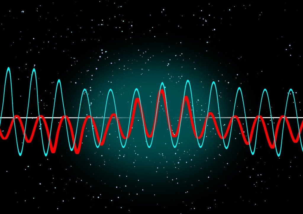
Many people of course, Tony included cannot see, or are partially sighted, so visualisation is not much help! Tony therefore worked on sonifying data instead, exploring how you can map data onto sounds rather than imagery in a way that does the same thing.: makes the patterns obvious and understandable.
His work in this area started with his PhD where he was exploring how breathing affects changes in heart rate. He first needed a way to both check for noise in the recording and then also a way to present the results so that he could analyse and so understand them. So he invented a simple way to turn data into sound using for example frequencies in the data to be sound frequencies. By listening he could find places in his data where interesting things were happening and then investigate the actual numbers. He did this out of necessity just to make it possible to do research but decades later discovered there was by then a whole research community by then working on uses of and good ways to do sonification,
He went on to explore how sonification could be used to give overviews of data for both sighted and non-sighted people. We are very good at spotting patterns in sound – that is all music is after all – and abnormalities from a pattern in sound can stand out even more than when visualised.
Another area of his sonification research involved developing auditory interfaces, for example to allow people to hear diagrams. One of the most famous, successful data visualisations was the London Tube Map designed by Harry Beck who is now famous as a result because of the way that it made the tube map so easy to understand using abstract nodes and lines that ignored distances. Tony’s team explored ways to present similar node and line diagrams, what computer scientist’s call graphs. After all it is all well and good having screen readers to read text but its not a lot of good if all it tells you reading the ALT text that you have the Tube Map in front of you. And this kind of graph is used in all sorts of every day situations but are especially important if you want to get around on public transport.
There is still a lot more to be done before media that involves imagery as well as text is fully accessible, but Tony showed that it is definitely possible to do better, He also showed throughout his career that being blind did not have to hold him back from being an outstanding computer scientists as well as a leading researcher, even if he did have to innovate himself from the start to make it possible.
Victorian, William Stanley Jevons was born in Liverpool in 1835. He was famous in his day as an economist and his smashhit book ‘The Coal Question’ drew the nation’s attention to the reduction in Britain’s coal supplies. He was the first economist to raise the issue of the ecological impact of economics.Jevons had other strings to his bow though and one of the strangest for the time if also incredibly forward thinking was his 1869 “logic piano”: a device that looked a little like a piano but that “played” logic.
Jevons was fascinated with logic and reasoning. He believed you could start with one thing (a premise) and from this work through a chain of reasoning to the conclusion. He thought that this could be done for everything. This was based on a principle he espoused of “the substitution of similars”: essentially reasoning based on the idea that “Whatever is true of a thing is true of its like”, For example, If Pharaohs are gods and Rameses is a Pharaoh (so is one of the things “like” a Pharaoh) then you can conclude Rameses is a god. He built on, and combined the ideas of, the Ancient Greeks with the then new ideas of George Boole, that we now call Boolean logic.
Boolean logic is based on a system of algebra using only the values of true and false (or 1 and 0), with operations corresponding to logical operations such as AND and OR that turn true/false values into new true/false values. This is the logic upon which computers are founded. A key idea was that you can abstract away from actual statements about truth in the real world and just replace them with variables that can stand for anything. Boole had laboriously shown using his logic how new abstract facts could be deduced from existing ones. Jevons realised that when reasoning was thought of like this, it became a mechanical process…and that meant a machine could do it.
His contemporary, Charles Babbage had been working on the idea of building mechanical “computers” but Babbage’s fundamental idea was that machines could do calculation. Jevon’s idea was slightly different and more fundamental: that machines could do logical reasoning, deducing new facts from existing ones. This was an idea that eventually came to fruition in the 20th century with the development of theorem provers where computers were programmed to do complex logical reasoning, even working on building up the whole of mathematics by proving ever more theorems from a few starting facts.
So, (with the help of an unknown craftsperson), Jevons set about designing and building his wooden Logic Piano. The idea was that you could put in the premises, the basic facts, by playing the keys of the “piano”. It would then mechanically apply his reasoning rules to discover all conclusions that could be deduced, altering its conclusion with each new fact added, The keys moved rods and levers that made logical facts appear on (or disappear from) the “display” of the machine – essentially facts on the rods appeared in slots cut into the back of the piano.
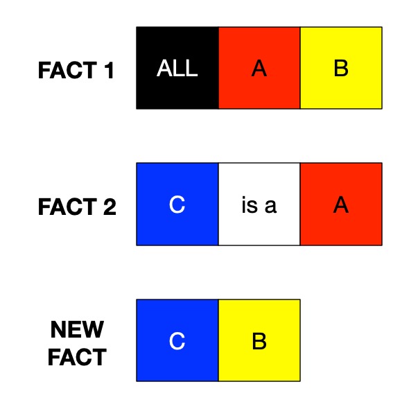
The kind of logical problem his machine worked with are Syllogisms (see Superhero Syllogisms). They were invented by the Ancient Greeks who were very good at logic. A syllogism is just a common pattern that combines facts where you figure out a conclusion only using the facts supplied, slotted into a template. For example, if we know facts 1 and 2 in the following template (where you can swap in anything for A, B and C) then we can create a new fact as shown.
Image by Paul Curzon
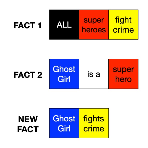
So let’s replace A with the word superheroes, B with fight crime and C with my favourite superhero, Ghost Girl. If we put them in to the template above we get a new “fact” deduced from two existing ones:
Image by Paul Curzon
Image by Paul Curzon
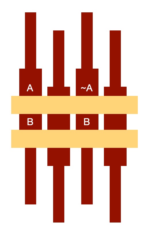
In the piano, a set of rods acted as truth tables, each one giving a true or false values for each variable. So imagine a piano that could deal with two variables A and B. Each of A and B can have two different values true and false, so there are four possibilities (so four rods):
(A, B);
(A, NOT B);
(NOT A, B);
(NOT A, NOT B)
where we write A to mean the assertion A is true and NOT A (or ~A in the picture) to mean A is false. Each rod represents a possible state of the world.
Let’s look at a simple example. Suppose A stands for the statement “Paul is a programmer” and B stands for “Safia is a programmer”, then the possibilities (if we know no specific facts) are
(Paul is a programmer, Safia is a programmer) : (A, B)
(Paul is a programmer, Safia is NOT a programmer) : (A, NOT B)
(Paul is NOT a programmer, Safia is a programmer) : (NOT A, B)
(Paul is NOT a programmer, Safia is NOT a programmer) : (NOT A, NOT B)
Image by Paul Curzon
Each rod in Jevon’s piano had one of the possibilities on, so each rod represented a possible state of the world being reasoned about. At the start all the rods were visible, showing that nothing specific was yet known.
The point is that these represent all possible states of the world about Paul and Safia and whether they are programmers or not. If we know nothing more then all we can say is that all the pairs of facts are a possibility: all are possible states of the world.
The piano worked by essentially leaving displayed or hiding each rod’s state as new facts were keyed in. (See the video at the end which includes a detailed explanation by expert David E Dunning on the detail of how it did this step by step). Initially all the possibilities are displayed as above. If we add a new fact that we have discovered or wish to assume, say that “Safia IS a programmer” (in terms of the piano, press the B key corresponding to the fact B is true), then doing so removes all states of the world where Safia is NOT a programmer. The piano, therefore, hides all the rods that include the assertion representing “Safia is NOT a programmer” (all those with (NOT B) on them) . We are left with two alternatives:
Image by Paul Curzon
(Paul is a programmer, Safia is a programmer) : (A, B)
(Paul is NOT a programmer, Safia is a programmer) : (NOT A, B)
The mechanics of the machine meant that those facts would remain a possibilities (reading down the rods) but pushing the keys for that assertion would have moved the other rods, so hide their state. In doing so, the piano has deduced from the fact B that the possible conclusions are A AND B is true or NOT A AND B is true.
With three variables instead of two the machine would be able to deal with more complex situations – there are then 8 possibilities so 8 rods representing the 8 different states. .
Image by Paul Curzon
Let A represent superheroes, (so NOT A represents those people who are not superheroes), B represents those people who fight crime and C with a person being Ghost Girl. Suppose we are considering some, at the moment, random person we know nothing about. The possibilities about them are:
(Is a superhero, does fight crime, is Ghost Girl) : (A, B, C)
(Is a superhero, does fight crime, is NOT Ghost Girl) : (A, B, NOT C)
(Is a superhero, does NOT fights crime, is Ghost Girl) : (A, NOT B, C)
(Is a superhero, does NOT fight crime, is NOT Ghost Girl) : (A, NOT B, NOT C)
(Is NOT a superhero, does fight crime, is Ghost Girl) : (NOT A, B, C)
(Is NOT a superhero, does fight crime, is NOT Ghost Girl) : (NOT A, B, NOT C)
(Is NOT a superhero, does NOT fights crime, is Ghost Girl) : (NOT A, NOT B, C)
(Is NOT a superhero, does NOT fight crime, is NOT Ghost Girl) : (NOT A, NOT B, NOT C)
If we put the fact about them into the piano that ALL superheroes fight crime (ALL A are B) then we remove all rods where A is true but B is different so false (a superhero who doesn’t fight crime) as in this world, that is impossible.
Image by Paul Curzon
(Is a superhero, does fight crime, is Ghost Girl) : (A, B, C)
(Is a superhero, does fight crime, is NOT Ghost Girl) : (A, B, NOT C)
(Is NOT a superhero, does fight crime, is Ghost Girl) : (NOT A, B, C)
(Is NOT a superhero, does fight crime, is NOT Ghost Girl) : (NOT A, B, NOT C)
(Is NOT a superhero, does NOT fights crime, is Ghost Girl) : (NOT A, NOT B, C)
(Is NOT a superhero, does NOT fight crime, is NOT Ghost Girl) : (NOT A, NOT B, NOT C)
Then we add the fact that Ghost Girl is a superhero (C is a A) so remove all those rods where Ghost Girl is not a superhero (ie NOT A, C):
Image by Paul Curzon
(Is a superhero, does fight crime, is Ghost Girl) : (A, B, C)
(Is a superhero, does fight crime, is NOT Ghost Girl) : (A, B, NOT C)
(Is NOT a superhero, does fight crime, is NOT Ghost Girl) : (NOT A, B, NOT C)
(Is NOT a superhero, does NOT fight crime, is NOT Ghost Girl) : (NOT A, NOT B, NOT C)
We have deduced (the first possible state) that if the person we are interested in is Ghost girl then she is a superhero. We are also left with other possibilities too. If the person we are considering is not actually Ghost Girl then they may or may not fight crime and may or may not be a superhero!
If we add in an additional fact that the person we are thinking of IS actually Ghost Girl then we remove those extra rods so possibilities and get
Image by Paul Curzon
(Is a superhero, does fight crime, is Ghost Girl) : (A, B, C)
Ghost Girl is a superhero who does fight crime! We knew she was Ghost Girl and was a superhero but using the piano we have now deduced that she does fight crime. The machine has deduced the syllogism we gave at the start.
IF ALL superheroes fight crime AND
   Ghost girl is a superhero
THEN
   Ghost girl fights crime.
The actual piano dealt with 4 variables (A, B, C, D) so had 16 rods representing the 16 different combinations. It also included keys to indicate the end of a conjecture, a key for IS A, and more to allow specific assertions to be input. The mechanism then hid rods automatically based on the facts entered. To use it, you did as we did: create a table of what A, B, C and D stand for (this is done outside the machine), enter the facts you want to reason about, and it then displayed all the possible states that remained in terms of A, B, C and D. Then, by seeing what each of the variables stood for in the table, you could convert that answer back into a deduced fact about the real world that you were interested in.
Amazingly, (after a first failed attempt) it did work. It is similar in idea to modern day theorem provers which are used to verify properties of safety-critical computer designs that must npot have bugs. Of course, being small and woody, the logic piano couldn’t solve every thing but then it turns out that was always an impossible dream. Even modern computers (and human mathematicians) have fundamental limits in what they can do (which is another story). The logic piano was a rather amazing, if woody, start to the area of automated theorem proving, though.
– Paul Curzon, Queen Mary University of London
Make a paper logic piano
Here is a kit to make a paper or card logic piano of your own (actually more like Jonons’ logic abacus the piano was a mechanised version of):
A Talk by David E Dunning at the Imagining AI conference about William Stanley Jevons and the logic piano including at the end a more detailed explanation of how pressing keys actually caused rods to by hidden in a series of steps. See also his article about it for the Computer History Museum.
Train timetables are complex. When designing a timetable for railways you have to think about the physical capabilities of the actual train, what stops it needs to make, whether it is carrying passengers or freight, the number of platforms at a station, the gradient of the track, and the placement of passing loops on single-track sections, amongst many other things. Data visualisation can help with timetabling and make sure our railways continue to run on track!
Data visualisation is an important area in computer science. If you had a huge amount of complex data in a spreadsheet, your first thought wouldn’t be to sit down with a cup of tea and spend hours reading through it – instead you might graph it or create an infographic to get a better picture. Humans are very bad at understanding and processing raw data, so we speed up the process by converting it to something easier to understand.
Timetabling is like this – we need to consider the arrival and departure times from all stations for each train. You might have used a (perhaps now) old fashioned paper timetable, with each train as a column, and the times at each station along the rows, like the one below. This is great if you’re a passenger… you can see clearly when your train leaves, and when it gets to your desired destination. If you’re unlucky enough to miss a train, you can also easily scan along to find the next one.
Image by Daniel Gill for CS4FN
Unfortunately, this kind of presentation might be more challenging for timetable designers. In this timetable, there’s a mix of stopping and fast services. You can see which of them are fast based on the number of stations they skip (marked with a vertical line), but, because they travel at different speeds it’s difficult to imagine where they are on the railway line at any one time.
One of the main challenges in railway timetabling, and perhaps the most obvious, is that trains can’t easily overtake slower ones in front of them. it’s this quirk that causes lots of problems. So, if you needed to insert another train into this timetable you would need to consider all the departure times of the trains around it, to make sure there is no conflicts – this is a lot of data to juggle.
But there’s an easier way to visualise these timetables: introducing Marey charts! They represent a railway on a graph, with stations listed vertically, time along the top, and each train represented by a single (bumpy) line. If we take our original timetable from above and convert it to a Marey chart, we get something that looks like this:
Image by Daniel Gill for CS4FN
Though thought to have been invented by a lesser-known railway engineer called Charles Ibry, these charts were popularised by Étienne-Jules Marey, and (perhaps unfairly) take his name.
How does it work?
There are a few things that you might notice immediately from this diagram. The stations along the side aren’t equally spaced, like you might expect from other types of graph, instead they are spaced relative to the distance between the stations on the actual railway. This means we can estimate when a fast train will pass each of the stations. This is an estimation, of course, because the train won’t be travelling at a constant speed throughout – but it’s better than our table from before which is no help at all!
Given this relative spacing, we can also estimate how fast a train is going. The steepness of the line, in this diagram, directly reflects the speed of the train*. Look at the dark blue and purple trains – they both leave Coventry really close together, but the purple train is a bit slower, so the gap widens near Birmingham International. We can also see that trains that do lots of stopping (when the line is horizontal) travel at a much slower average speed than the fast ones: though that shouldn’t be a surprise!
*There’s a fun reason that this is the case. The gradient (the steepness of the line) is calculated as the change iny divided by the change in x. In this case, the change in the y dimension is the distance the train has travelled, and the change in x is the time it has taken. If you have studied physics, you might immediately recognise that distance divided by time is speed (or velocity). Therefore, the steepness in a Marey chart is proportional to the speed of the train.
We can also see that the lines don’t intersect at all. This is good, because, quite famously, trains can’t really overtake. If there was an intersection it would mean that at some point, two trains would need to be at the same location at the same time. Unless you’ve invented some amazing quantum train (more about the weirdness of quantum technology in this CS4FN article), this isn’t possible!
Putting it to the Test
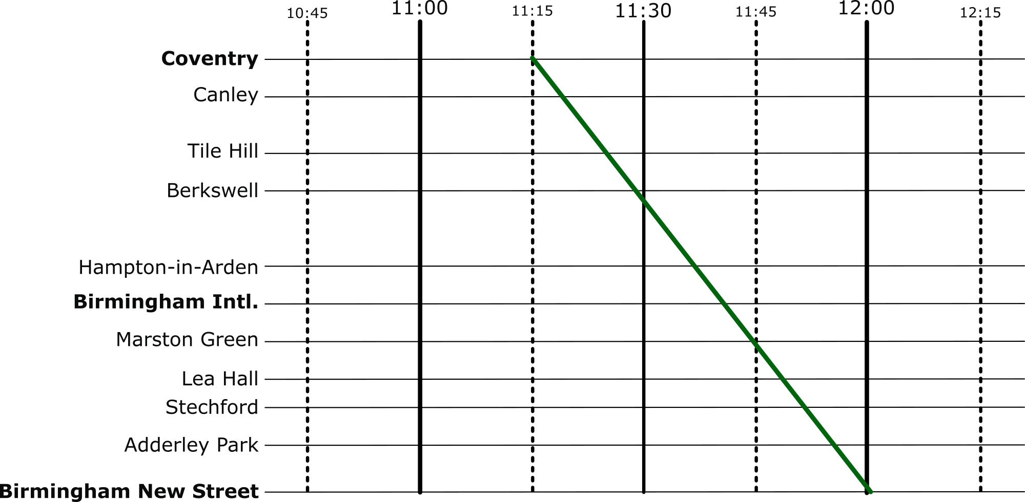
Put yourself in the shoes of a railway timetable designer! We have just heard that there is a freight train that needs to run through our little section of railway. The driver needs to head through sometime between 10:45 and 12:15 – how very convenient: we’ve already graphed that period of time.
The difficulty is, though, that their freight train is going to take a very slow 45 minutes to go through our section of railway – how are we going to make it fit? Let’s use the Marey chart to solve this problem visually. Firstly, we’ll put a line on that matches the requirements of the freight train:
Image by Daniel Gill for CS4FN
And then let’s re-enable all the other services.
Image by Daniel Gill for CS4FN
Well, that’s not going to work. We can see from this, though, how slow this freight train actually is, especially compared to the express trains its overlaps with. So, to fix this, we can shift it over. We want to aim for a placement where there are no overlaps at all.
Image by Daniel Gill for CS4FN
Perfect, now it’s not going to be able to make the journey without interfering with our other services at all.
Solving Problems
When we’re given a difficult problem, it’s often a good idea to find a way to visualise it (or as my A-Level physics teacher often reminded me: “draw a diagram!”). This kind of visualisation is used regularly in computer science. From students learning the craft, all the way to programmers and academics at the top of their field – they all use diagrams to help understand a problem.
Florence Nightingale, the most famous female Victorian after Queen Victoria, is known for her commitment to nursing, especially in the Crimean War. She rebelled against convention to become a nurse at a time when nursing was seen as a lowly job, not suitable for ‘ladies’. She broke convention in another less well-known, but much more significant way too. She was a mathematician – the first woman to be elected a member of the Royal Statistical Society. She also pioneered the use of pictures to present the statistical data that she collected about causes of war deaths and issues of sanitation and health. What she did was an early version of the current Big Data revolution in computer science.
Soldiers were dying in vast numbers in the field hospital she worked in, not directly from their original wounds but from the poor conditions. But how do you persuade people of something that (at least then) is so unintuitive? Even she originally got the cause of the deaths wrong, thinking they were due to poor nutrition, rather than the hospital conditions as her statistics later showed. Politicians, the people with power to take action, were incapable of understanding statistical reports full of numbers then (and probably now). She needed a way to present the information so that the facts would jump out to anyone. Only then could she turn her numbers into life-saving action. Her solution was to use pictures, often presenting her statistics as books of pie charts and circular histograms.
Whilst she didn’t invent them, Florence Nightingale certainly was responsible for demonstrating how effective they could be in promoting change, and so subsequently popularising their use. She undoubtedly saved more lives with her statistics than from her solitary rounds at night by lamplight.
She had collected data on the reason each person died but to present the data in ways that were convincing she also had to act as a human computer doing computation on the basic data. For each month based on the raw data, she computed annual rate of mortality per 1,000. Then to present it in a circular histogram, where the area represents deaths she calculated the appropriate radius for each segment, allowing the charts to then be drawn.
Big Data is now a big thing. It is the idea that if you collect lots of data about something (which computers now make easy) then you (and computers themselves) can look for patterns and so gain knowledge and, for people, ultimately wisdom from it. Florence Nightingale certainly did that. Data visualisation is now an important area of computer science. As computers allow us to collect and store ever more data, it becomes harder and harder for people to make any sense of it all – to pick out the important nuggets of information that matter. Raw numbers are little use if you can’t actually turn them into knowledge, or better still wisdom. Machine Learning programs can number crunch the data and make decisions from it, but its hard to know where the decisions came from. That often matters if we are to be persuaded. For humans the right kind of picture for the right kind of data can do just that as Florence Nightingale showed.
‘The Lady of the Lamp’: more than a nurse, but also a remarkable statistician and pioneer of a field of computer science…a Lady who made a difference by rebelling with a cause.