by Daniel Gill, Queen Mary University of London

Train timetables are complex. When designing a timetable for railways you have to think about the physical capabilities of the actual train, what stops it needs to make, whether it is carrying passengers or freight, the number of platforms at a station, the gradient of the track, and the placement of passing loops on single-track sections, amongst many other things. Data visualisation can help with timetabling and make sure our railways continue to run on track!
Data visualisation is an important area in computer science. If you had a huge amount of complex data in a spreadsheet, your first thought wouldn’t be to sit down with a cup of tea and spend hours reading through it – instead you might graph it or create an infographic to get a better picture. Humans are very bad at understanding and processing raw data, so we speed up the process by converting it to something easier to understand.
Timetabling is like this – we need to consider the arrival and departure times from all stations for each train. You might have used a (perhaps now) old fashioned paper timetable, with each train as a column, and the times at each station along the rows, like the one below. This is great if you’re a passenger… you can see clearly when your train leaves, and when it gets to your desired destination. If you’re unlucky enough to miss a train, you can also easily scan along to find the next one.

Unfortunately, this kind of presentation might be more challenging for timetable designers. In this timetable, there’s a mix of stopping and fast services. You can see which of them are fast based on the number of stations they skip (marked with a vertical line), but, because they travel at different speeds it’s difficult to imagine where they are on the railway line at any one time.
One of the main challenges in railway timetabling, and perhaps the most obvious, is that trains can’t easily overtake slower ones in front of them. it’s this quirk that causes lots of problems. So, if you needed to insert another train into this timetable you would need to consider all the departure times of the trains around it, to make sure there is no conflicts – this is a lot of data to juggle.
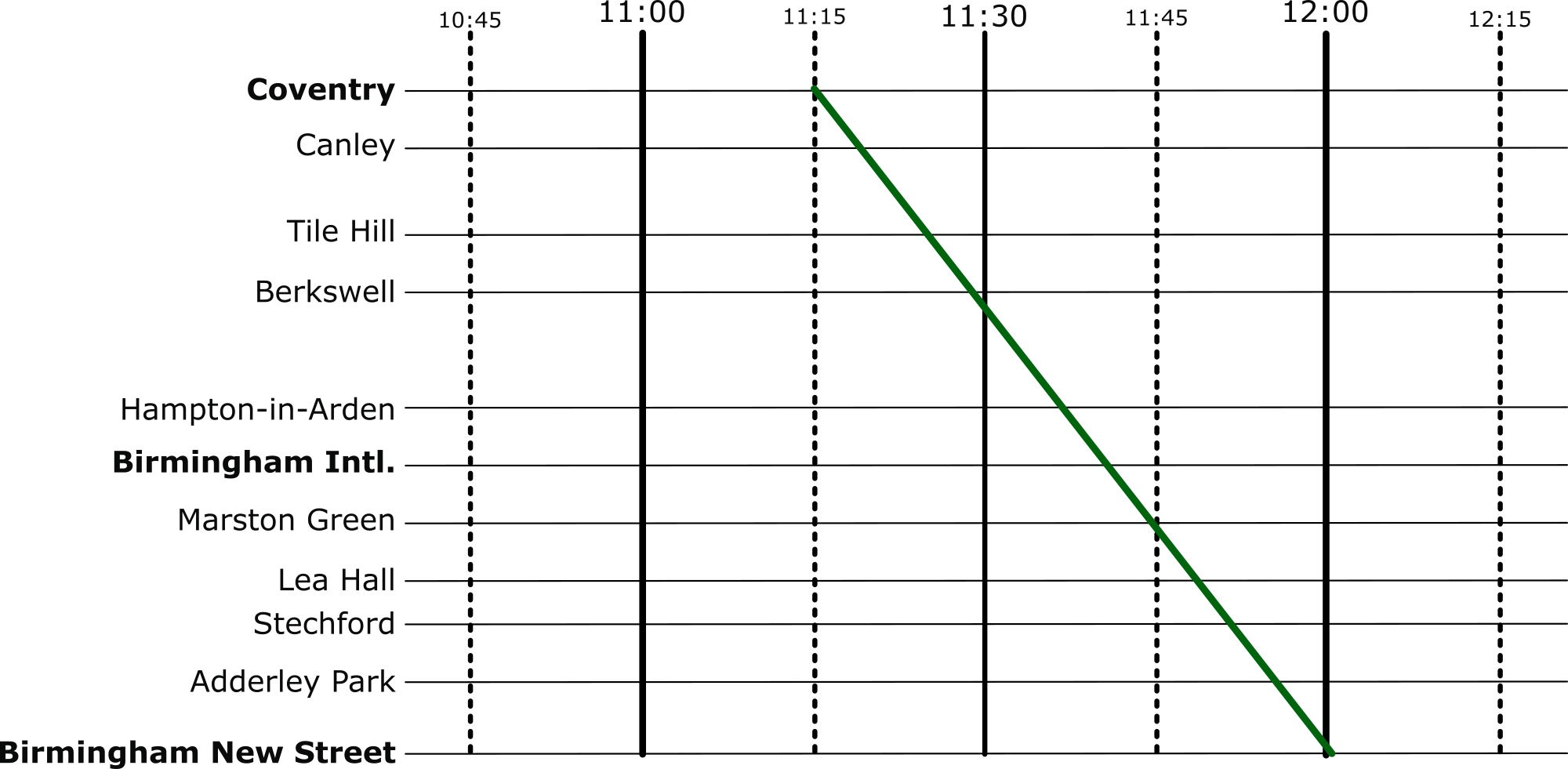
But there’s an easier way to visualise these timetables: introducing Marey charts! They represent a railway on a graph, with stations listed vertically, time along the top, and each train represented by a single (bumpy) line. If we take our original timetable from above and convert it to a Marey chart, we get something that looks like this:

Though thought to have been invented by a lesser-known railway engineer called Charles Ibry, these charts were popularised by Étienne-Jules Marey, and (perhaps unfairly) take his name.
How does it work?
There are a few things that you might notice immediately from this diagram. The stations along the side aren’t equally spaced, like you might expect from other types of graph, instead they are spaced relative to the distance between the stations on the actual railway. This means we can estimate when a fast train will pass each of the stations. This is an estimation, of course, because the train won’t be travelling at a constant speed throughout – but it’s better than our table from before which is no help at all!
Given this relative spacing, we can also estimate how fast a train is going. The steepness of the line, in this diagram, directly reflects the speed of the train*. Look at the dark blue and purple trains – they both leave Coventry really close together, but the purple train is a bit slower, so the gap widens near Birmingham International. We can also see that trains that do lots of stopping (when the line is horizontal) travel at a much slower average speed than the fast ones: though that shouldn’t be a surprise!
*There’s a fun reason that this is the case. The gradient (the steepness of the line) is calculated as the change in y divided by the change in x. In this case, the change in the y dimension is the distance the train has travelled, and the change in x is the time it has taken. If you have studied physics, you might immediately recognise that distance divided by time is speed (or velocity). Therefore, the steepness in a Marey chart is proportional to the speed of the train.
We can also see that the lines don’t intersect at all. This is good, because, quite famously, trains can’t really overtake. If there was an intersection it would mean that at some point, two trains would need to be at the same location at the same time. Unless you’ve invented some amazing quantum train (more about the weirdness of quantum technology in this CS4FN article), this isn’t possible!
Putting it to the Test
Put yourself in the shoes of a railway timetable designer! We have just heard that there is a freight train that needs to run through our little section of railway. The driver needs to head through sometime between 10:45 and 12:15 – how very convenient: we’ve already graphed that period of time.
The difficulty is, though, that their freight train is going to take a very slow 45 minutes to go through our section of railway – how are we going to make it fit? Let’s use the Marey chart to solve this problem visually. Firstly, we’ll put a line on that matches the requirements of the freight train:
And then let’s re-enable all the other services.

Well, that’s not going to work. We can see from this, though, how slow this freight train actually is, especially compared to the express trains its overlaps with. So, to fix this, we can shift it over. We want to aim for a placement where there are no overlaps at all.

Perfect, now it’s not going to be able to make the journey without interfering with our other services at all.
Solving Problems
When we’re given a difficult problem, it’s often a good idea to find a way to visualise it (or as my A-Level physics teacher often reminded me: “draw a diagram!”). This kind of visualisation is used regularly in computer science. From students learning the craft, all the way to programmers and academics at the top of their field – they all use diagrams to help understand a problem.
More on …
Magazines …


EPSRC supports this blog through research grant EP/W033615/1,
